Introduction
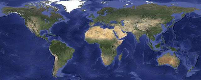
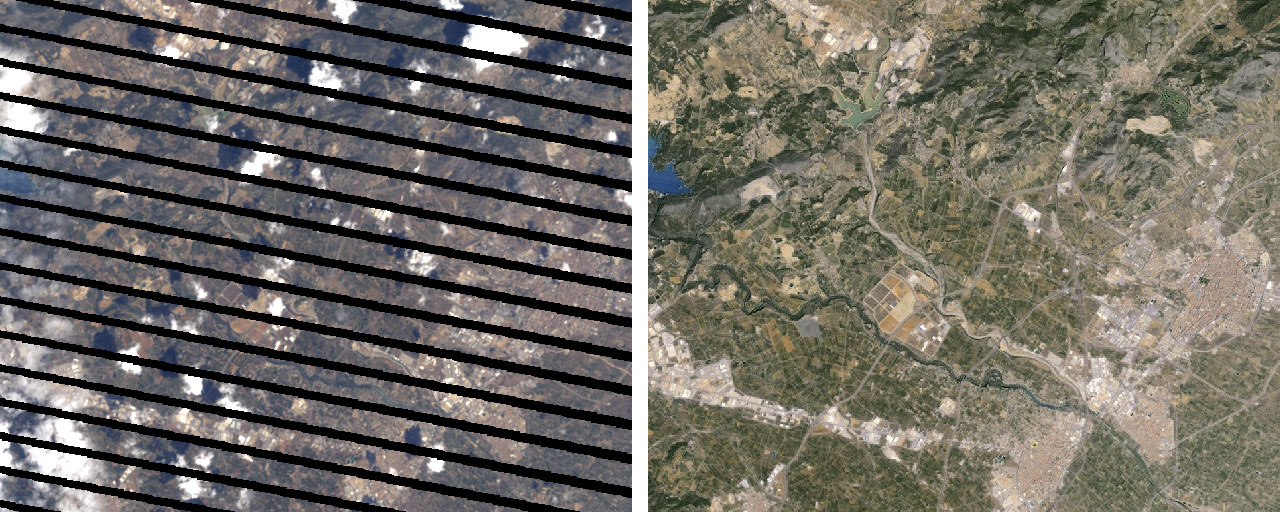
In 2013, Google announced the creation of a cloud-less, night-less, Spring-all-over image of the Earth. This new cloud-free image–assembled from a 40-year archive of satellite images–allowed anyone to see, with perfect clarity, any spot on the Earth’s surface. Creating this new image upgraded Google’s mapping products. Older and less-clear images were updated. Certain parts of the world were now brought into greater visibility. Engineers replaced corrupted imagery, as in the infamous case of LandSat7, where a malfunction on one of the satellite’s censors caused all its images to appear with diagonal black stripes. All in all, there had never been a view onto the Earth as faultless as this one.
Faultless, yes; but accurate? To say that the cloud-free image of the Earth is also an accurate image of the Earth is both true and untrue. It is true that this pristine, cloud-free Earth image was meticulously assembled from an archive of satellite images, so it is built of imagery that is accurate enough to be used in scientific research and regularly is. However, it is also true that while the cloud-free image shows the Earth’s topography with unprecedented clarity, it does so by presenting the Earth under fantastical viewing conditions. These include the most obvious–an Earth without clouds and weather systems and tropical climates. It also presents the Earth as a planet without rotation, or in other words, as if the Earth was experiencing daylight and springtime simultaneously, the entire globe over. These are all physical impossibilities.
Do any of these details amount to enough to make a claim against the ‘accuracy’ of Google’s cloud-free image? If you ask Google engineers, this cloud-free image–what they refer to as Pretty Earth Image–and is just that: a pretty image. Engineers explain that Pretty Earth Image gives the ‘appearance of realism’–a claim to truthfulness that is not one-to-one, but something not entirely disconnected from it. Yet, the process of creating Pretty Earth Image was a computational challenge, and figuring out the solution played a role in the founding of Google Earth Engine,1 a public platform that consolidates geospatial datasets and satellite imagery to support planetary-scale analysis. Earth Engine is used for research on a range of issues that can be addressed by studying overhead images of the Earth’s topography, and especially for monitoring these images for changes over time. For this reason, the accuracy, truthfulness, or ‘realism’ of the data displayed on Earth Engine is of primary importance. However, Pretty Earth Image appears in Google’s mapping products and Google Earth (a 3D Earth visualization program) but is not used in Earth Engine–despite its faultless and unprecedently clear view onto the Earth’s topography.
While Pretty Earth Image may appear in Google Earth and not in Earth Engine, this is not to say that Pretty Earth Image is irrelevant to Earth Engine. What is relevant Earth Engine is the digital method that allowed the Earth Engine engineers to remove clouds, nighttime, and seasons from a 40-year archive of satellite images. For the Earth Engine engineers, Pretty Earth Image is a byproduct of a digital process that served as proof of concept for Google’s computing capacity and ability to support targeting, sorting, and removing classifiers in geospatial datasets, and at large scales. Yet once the process was in place, this ‘byproduct’ (while supportive of many Google products) was treated as residual to the more central computing and scientific work. Pretty Earth Image became of secondary relevance, if at all.
Given the value of objectivity in scientific inquiry and the longer histories of the relationship between art and science and image and inquiry, this separation would seem to make sense. The problem is that there is no clear distinction between a digital image and the digital process that produced it. To say that the digital image is alchemized into something ontologically discrete from pixels, for example, is to disregard the materiality of the digital and the history of computer graphics. As scholars such as Jacob Gaboury have shown, the history of computing hardware makes the case that what is interpreted as data and the way that data gets displayed are materially inseparable elements. The earliest forms of the pixel were innovations in data storage and recall. The point is made more literally when we transpose the terms of this debate onto scientific inquiry that makes use of images and data visualization. Satellite images are often used as measurements and stand-ins for direct observation, and the manner of their display is not separable from their interpretation. In fact, it is sometimes these qualities of display–brightness, and contrast, for example–that are what bring data into visibility.
These are the central knots to which this article is addressed. How can we conceptually reconcile the idea that Pretty Earth Image gives an appearance of realism that is sufficient for mapping products, but not for analysis, while at the same time acknowledging that histories of the digital image dictate that such a distinction isn’t tenable in the first place? Relatedly, what does it mean for a digital image, composed of satellite imagery, to give an ‘appearance of realism?’ How are digital mediums and ways of working with digital and long-range sensing technologies transforming our aesthetic categories–in this case, our notions of realism? This article makes the case that images and aesthetics are overlooked discourses in the context of scientific computing and that such an oversight is necessitating the reimagining of epistemological categories as aesthetic ones. Using the cloud-removal project as a case study, I will demonstrate how the thresholds for true/untrue have been vaguely redefined around an idea of ‘realism’ that has both explicit and implicit criteria for inclusion–most regularly determined by hardware capacities and end-user use value.
In what follows I will elaborate on three registers of realism established through the ambiguity and entanglements of the cloud-removal project and the Pretty Earth Image. The first register focuses on Pretty Earth Image as a technique (and not merely ‘a pretty picture’ or an inert result) of determining realism. Through a close reading of interviews with Earth Engine founders Noel Gorelick and Matt Hancher I draw out the ways that the language used by the engineering team subtly defined–and re-defined–thresholds of realism. The naming of Pretty Earth Image shows how ‘picture-ing’ realism draws on tacit, ambivalent classifiers to identify a ‘pretty picture’ as something unrelated to the visual artifacts of geosensing tools. By contrast, a second register focuses on the technical determinates of geosensing data and computer graphics outputs. Here, pixels function solely as a heuristic for determining a ‘realistic’ (and reasonable) view onto environmental/geosensing data. When discussing digitally-stored geosensing data that takes the form of a pixel, the pixel’s simultaneous function as a fundamental unit in computer graphics at large–and the Pretty Earth Image specifically–isn’t acknowledged verbally by Google engineers nor by the workflows that support working with it. By examining these two registers as distinct yet side-by-side, their overlaps, redundancies, and inconsistencies are bought into relief. The third register takes a macro view onto the cloud-removal project and engages with the instabilities of the digital image that are made more pronounced when thinking about its instrumentalization in geosensing research. Following the critiques of Pretty Earth Image’s discursive and computational registers of realism, what value does the designation of ‘image’ still hold as a format for data and for realism? By way of a conclusion, I end with a gesture towards the debate I believe the cloud-removal case study more rightly brings us to: what is, or can be, a definition of realism under the as-yet-undefined conditions of digital ontology.
Method, and a Note on Google Overwhelm
My understanding and description of the cloud-removal method is primarily taken from an account Matt Hancher gave during a 2016 interview and supplemented by published papers that Hancher directly referenced. In 2022, Hancher and his Earth Engine co-founder Noel Gorelick (now the Chief Extraterrestrial Officer) were interviewed again. These interviews provided clarification and updates to the original interview, such as that the clouds had been added back into Google Earth, and that there were plans to monetize Earth Engine in the summer of 2022. While I would not classify Hancher and Gorelick’s interviews as oral histories per se, they are nevertheless first-hand accounts of a time, place, and experience in the Google corporate universe. Their phrasing and explanations have been treated as evidence and exposition. This presents a certain number of benefits and challenges.
One challenge of doing analysis in this way is that the cloud-removal method description provided by my informants is not a fine-grained, technical one, but rather a more generalized description. Interview conversation perhaps does not lend itself to technical detail: it’s boring, it’s tedious, it’s dry. For the interviewee, it requires more of a regurgitation of events and does not present the opportunity for the kinds of self-reflection and critical thinking on an achievement that is more personalized, and thus more fun. Or it could be the case that information at this level of detail is something both interviewees felt inappropriate to share in this venue, whether as a safeguard against competition or the disapproval of their employer. A third option still is a possible failure of the interviewer to push for this level of information (perhaps because they, too, might have found the topic boring, tedious, and dry).
Nevertheless, Hancher and Gorelick’s generalized description is still fruitful. For one, the descriptions are sufficient to mark out those aspects of the cloud-removal case study most salient to this paper’s central focus. This affirms that the fine detail of the technical and mathematical aspects of the cloud-removal process falls outside of the scope of the concerns outlined in this paper. Researchers looking for information at this level of detail, however, may be successful in their own searches, working through some of the papers cited here or borrowing keywords highlighted in quoted interview materials. A second benefit of the generalized descriptions is that they help expand the reach of this article’s information beyond those people who have high-level knowledge of math, science, and computing. Demystifying computing creates opportunities for more people with varied knowledges to make meaningful connections to hardware and software. This aligns with my personal contention that making the case for the significant, interrelatedness of technology, politics, and culture is one of the most urgent projects of cultural studies today.
It is the fear of every media scholar that their work might be ungenerously received as a ‘hagiography’ of Google. Yet it is precisely the unprecedented computing and intellectual power that is concentrated in the Alphabet conglomerate that creates a black hole for media research. Here I have tried to walk a fine line. This article targets an interesting computational approach with intersections with many important registers: environmental policy, political economy, and philosophies of scientific and computational aesthetics. While my desire is to focus on digital aesthetics as a nodal point of all these registers, this work is meaningless if not situated in its appropriate context. Therefore, I have dedicated a section of this article to specifically focusing on Earth Engine’s business, culture, and history. Readers may find this section of interest for their own background knowledge, or for further work on Google and/or Alphabet-related topics. Readers who are uninterested in this history may choose to skip, skim, or selectively sample this section with little consequence for their understanding of my overall argument.
A Brief History of Google Earth Engine
The story of Google Earth Engine begins in 2008 with Google Trees. It’s a product you’ve never heard of because, ultimately, it was never made. But the idea started with Rebecca Moore and her desire to map every tree in the world.
Moore took this idea to Noel Gorelick–now Google’s Chief Extraterrestrial Observer. Moore proposed that Google map every tree in the world and whenever one got cut down ‘you would get an email.’ Gorelick was skeptical. ‘I said, that’s a terrible idea, I don’t like that idea at all.’ But Moore was insistent, returning to Gorelick with a refined version of the idea and later, at Gorelick’s request, arranging for Matt Hancher to be hired and assigned to the project alongside Gorelick. ‘I was proposing (hiring Hancher) as an impossible task. Like, this will take her a year,’ Gorelick explains, ‘(Hancher) was sitting next to me five weeks later.’
Together Gorelick and Hancher tackled Moore’s Google Trees idea as a project of computing deforestation and performing global deforestation monitoring.2 Gorelick and Hancher pulled from international experts and existing projects with the offer of using Google’s ‘giant parallel processing infrastructure.’ Working with their internal motto that ‘we don’t know what we’re doing until we’ve done it three times,’ Gorelick and Hancher’s team found three experts and ‘implemented their algorithms three times.’ Following this trio of successes, the team then turned their attention to refining the process in terms of scale and efficiency. Once Gorelick and Hancher felt they had built something to a sufficient standard on deforestation and deforestation monitoring, the question then became ‘What can we put together into sort of a general purpose system so that we don’t have to keep building separate systems each time?’
Earth Engine was officially announced as a Google Labs product in 2010 at the International Climate Change Conference in Cancún, Mexico, and launched as a ‘new technology platform that puts an unprecedented amount of satellite imagery and data—current and historical—online for the first time.’3 Earth Engine answered the call for a more maneuverable way to work with the overwhelming volumes of information housed in satellite image archives and the heavy demand on hardware working with these images requires.
Google’s extraordinary computing power and capabilities allow Earth Engine to make accessible datasets that extend beyond satellite image archives (such as Landsat and Sentinenel-1 and Sentinel-2) to also include ‘climate forecasts, land cover data, and many other environmental, geophysical and socio-economic datasets.’4 Earth Engine’s public data catalogue is a ‘multi-petabyte curated collection of widely used geospatial datasets’ and is its most valuable feature. What Earth Engine calls its ‘public data catalogue’ is a collation of geosensing data made available to all for download, free of charge, across a variety of data portals in both the US and Europe, and ‘continuously updated at a rate of nearly 6000 scenes per day from active missions, with a typical latency of about 24h from scene acquisition time.’5
It may come as a surprise to know that the Earth Engine platform behaves somewhat like a social media platform, in the sense that it is user-based and user-oriented. Earth Engine users have significant influence over the design and functionality of Earth Engine. Since the start of Earth Engine, users have been able to request new datasets be added to Earth Engine’s public data catalog, ‘or they can upload their own private data via a REST interface using either browser-based or command-line tools and share with other users or groups as desired.’6
Additionally, a limited group amongst Earth Engine’s user base are considered top users, and many of these top users are in close contact with Earth Engine engineers. In his interview, Gorelick explains these users are typically academics or scientists who make direct requests for the kinds of specific functionality they’d like to see in Earth Engine to support their specific research projects (to which Earth Engine engineers are typically happy to oblige). The requests to ‘customize’ Earth Engine form the basis of a mutually beneficial relationship. The relationship allows Earth Engine users to have tailor-made software for their specific research goals, and for engineers, these requests often push them to create a better ‘product.’
An additional benefit of the responsiveness between Earth Engine engineers and users is that it provides an avenue for Google to track and measure their product through its applications in the ‘real’ world. Three user forums–under “Support” and “Community” pages on the Google Earth Engine site; a Google Earth Engine Developers Google group; and a community tag for ‘google-earth-engine’ on the Geographic Information Systems Stack Exchange forum–provide one set of evidence for who, how, and why users are using Earth Engine. The working relationship between Earth Engine and its user base is developed to such a degree that–despite having a user base of about 500,000–Gorelick can describe off the top of his head who the Earth Engine user is, and how they are using his product. About 20% of Earth Engine users, Gorelick estimates, are students who engage the platform once and never come back (presumably for a class or some other limited project of that sort). A ‘core’ user is typically a new PhD graduate or an associate professor, maybe someone ‘a little further up the chain.’ This group of core users is characterized not so much by their professional standing (even while they may all share this in common) but instead by their maverick motivations for engaging the platform. This core user, Gorelick explains, ‘has this crazy idea of, If I could just map all the banana trees in the world! I could something, something, something… We call them the “wild-eyed professors.” We really like those guys.’ Driven by limitless creativity and ambition, these ‘wild-eyed professors’ push Earth Engine into increasingly creative and innovative directions.
The pairing of Earth Engine engineers and ‘wild-eyed professors’ is the sweet spot of Google’s internal philosophy and approach to work. It encapsulates the possibility of solving important real-world issues married with the challenge of innovating through computational barriers, all with the added benefit of enhancing Google’s software product. However, this sweet spot is also a stumbling point. While the benefit of the wild-eyed professors is that they constantly push the Earth Engine platform, there often comes a point at which, through this ‘idea research development,’ the wild-eyed professors will find their own niche and ‘build an app for just seeing their own results, but also sharing it with other people.’7 Gorelick explains that, eventually, these users will say, Hey, I can make money with this! and they’ll start a business. And then we never hear from them again because they then consider everything they’ve done after that to be proprietary.’ This moment is a real loss for Earth Engine because it limits the team’s ability to track the impact and reach of its product. With the loss of connection, as users move off the platform, Earth Engine no longer has a method for reflecting on its own public good and utility value.
Earth Engine does, in fact, see itself as a public good. Its mission is to apply the advantages of computing to solving the world’s most difficult problems. As a platform trafficking in environmental sensing data, its number one challenge is climate change. This is why Earth Engine is so supportive of scientists using their platform to try to make inroads in environmental science and policy. However, a mission to ‘solve the world’s most unsolvable problems related to climate change is a hard one to track. One possible method for measuring the impact of Earth Engine might include connecting research carried out on Earth Engine to changes in policy. While the indexing system Scopus allows for the Google Earth team to search for references to themselves and their work in policy documents, the practice of including citations in policy documents is not exhaustive or, by Gorelick’s account, even that popular. There is also the additional challenge of creating a metric that might reasonably account for distributed or indirect relationships between Earth Engine and policy. As Gorelick puts it, ‘whatever we do back here,’ he says, referring to Earth Engine’s computational and engineering work, ‘may or may not translate into any results on the other end.’ While at present, Earth Engine might be able to claim influence over four pieces of policy, and has, by its accounting, ‘spawned… maybe a hundred companies or so,’ its ability to create metrics for itself– ‘to be measurable and actionable’–in combating climate change and solving the world’s most difficult problems is a persistent challenge.
To this end, in the summer of 2022, Earth Engine announced for the first time ever that it was beginning to sell a commercial-use license. This is an attempt to retain some users who leave the platform to go commercial (presumably these are Earth Engine’s beloved ‘wild-eyed professors’). It also creates opportunities for recruiting new users. For example, the preview for commercial-use Google Earth was launched through a collaboration with Unilever.8 This first-time collaboration seems primed to signal a new era of corporate partnerships, accountability, and Big Data. In an announcement on their website, Unilever writes, ‘While several academic and public organisations already use Google Earth imagery this is the first time it’s been applied commercially for commodity sourcing.’9 Across the literature for both companies the collaboration between tech and commodity sourcing is presented as an advancement of ‘sustainable business practice.’ With the guidance of ‘simplif(ied) complex data sets,’ the collaboration proposes to ‘increas(e) transparency within supply chains and enabl(e) collaboration across public and private partners.’10
Earth Engine/Unilever’s focus on securing supply chains comes at a particularly apt time, as interruptions to the global supply chain because of the Covid-19 pandemic have made an otherwise invisible process acutely felt at the international, national, and domestic levels. Unilever’s concern for sustainability, now matched with Earth Engine’s commitments to civic good, also present as an actionable step towards answering demands for corporate ethics and accountable capitalism. But we might also surmise that Earth Engine’s movement into corporate collaborations solves a more self-serving problem: tracking. Earth Engine stands to exponentially increase the ability to track the success of their work by siphoning their products into the Unilever machine, and subsequently, a new grammar of consumer supplies, demand, satisfaction, and overall logistics.
It remains to be seen how Earth Engine’s free-to-use services and platform might change in response to this development. Will this new venture clarify the goals of Earth Engine, and reaffirm Earth Engine’s mission of promoting sustainability and combating climate change? Despite the novelty of a new commercial service and collaboration with Unilever, a noteworthy coincidence is that the launching ‘product’ is built on Earth Engine’s original technology: monitoring deforestation. Does this suggest that the engineering innovations and challenges that pushed Earth Engine into the product it is today will still originate from its core users–the ‘wild-eyed professors’–and if so, how will these users respond to the new changes in the platform? And what, overall, does this say about a culture of science and computing innovation that even an organization as large as Google cannot sustain without branching into larger, potentially more impersonal, private-sector ventures?
Removing the Clouds from (Google) Earth
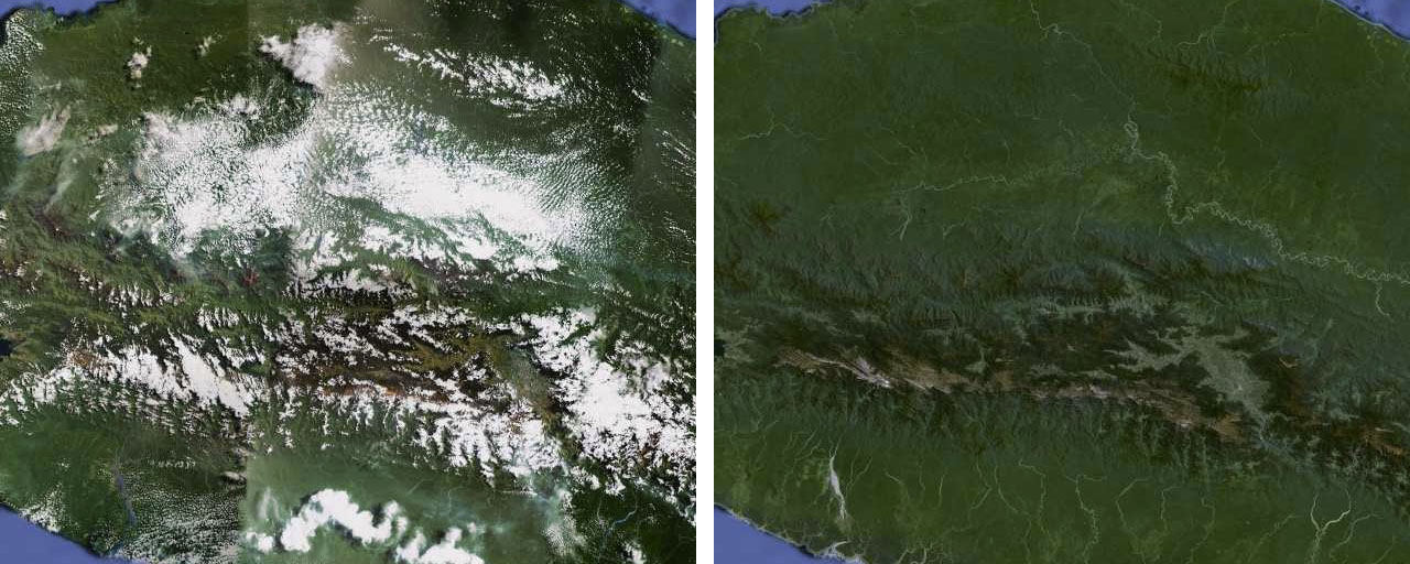
On June 26, 2013, Matt Hancher wrote a blog post titled, ‘Only clear skies on Google Maps and Earth’.11 In the same post, Hancher proudly announced, ‘To celebrate the sunny days of summer … we’re unveiling new satellite imagery for all Google mapping products today. This stunning new imagery of the earth from space virtually eliminates clouds … and offers a more comprehensive and accurate view of the texture of our planet’s landscape.’ The grand arrival Hancher was announcing was for a picture of the entire globe, assembled from an archive of forty years of satellite images, which showed the Earth as it would appear on a cloudless, spring day, with all the globe experiencing daylight at the same time. It was, and perhaps still is, to date, the most accurate image of the Earth’s topography in existence. It is also a fabrication.
To begin the process of making the cloud-free Google Earth image, the Earth Engine team engineered systems to work pixel by pixel, first aggregating images and topographical data pertaining to the Earth collected from LandSat satellites, US Geological Survey (USGS) data reserves, and other various geospatial data archives. From these stores of data and images, engineers segmented the earth into workable, geographic regions. Within each region, areas of ‘cloudiness’ were identified according to the RGB color of each pixel. Engineers then isolated the regional images’ white pixels, or ‘cloud-defective’ pixels.
The task of removing clouds from any satellite image is a tedious task. It cannot work as a simple one-to-one, edit-and-replace project because there are so many other multiple-variable influences on the appearance of clouds. Clouds move, clouds are polymorphously shaped, and they have different densities; cloud brightness and cloud shadow can throw off other measurements such as atmospheric corrections, not to mention that the angle at which the images are taken can affect cloud presentation, and so on.12
Clouds, however, present an additional challenge in their digital representations. Hancher explains that ‘Clean ice and fresh clouds both look white in red, green, and blue, but there’s a distinction in some of the infrared bands.’ To account for what was definitively cloud cover, and not glacier, the team had to create their own heuristics. Hancher described this heuristic as, ‘It’s just looking at how bright the pixel is in these different bands, looking at some of the ratios … between those bands, to try to assess or really just score the pixel.’ He adds, ‘It’s not really a likelihood measure, it’s just sort of a cloudiness measure.’’
Pixels that were white and determined to be definitively related to cloud cover were marked out as ‘cloud-defective.’ For every cloud-defective pixel, servers mined the collected LandSat ‘time series’ to find a pixel in that exact same geographic location that was not cloud-defective. Once a cloud-defective pixel was identified, it was then replaced with a non-cloud-defective pixel drawn from an image of the relevant position on earth. Satellites orbit the Earth both laterally and on its perpendicular axis while the Earth is rotating. This simultaneous action is what is referred to as ‘precession.’ Accounting for both the orbit of the satellite and the precession of the Earth, satellites will return to image the same spot every two weeks. This information provides an important base unit of measurement for anyone working with a satellite time series.
Once all cloud-defective pixels were identified and replaced, the earth image underwent a further filtering/editing process to ensure that all the pixels were springtime, daylight pixels. The completed image then stitched together all of the working regions to make a complete world view, resulting in an 800,000-megapixel seamless image.
What’s in a Name?
One of the clearest lessons we learn from the way that Hancher and Gorelick talk about their work removing the clouds from their stitched image of Earth is that there exist distinctions and boundaries between digital images and digital processes. From the outset, Hancher is explicit that the focus of the entire cloud-removal project was ‘not so much a scientific result as it was a pretty picture that we could use in our product, that would be attractive and would accurately reflect the landscape.’ In a separate interview, Gorelick confirms the same. ‘If you’re talking about Google Maps image or Google Earth image, (removing the clouds) didn’t have to happen–doing it made a better product,’ Gorelick notes, ‘And so that was the decision why to do it.’ Gorelick refers to a ‘patchy’ 2012 screenshot from Google Earth. ‘It was not a great global image. You can see all kinds of image seams, there are a few clouds hanging around, that sort of thing. And our VP (Brian McClendon) said, Can’t you guys do something about this terrible image? And so that was the initiative for making what we call Pretty Earth Image.’
The emergence of Pretty Earth Image –and even its nickname– encapsulates the discursive ambiguities that both shape and muddle the cloud-free Google Earth project. Let’s consider for a moment all the strands of same-but-different narrativizing that describe Google’s cloud-removal work. For clarity, my characterization of the narrative has been differentiated from the body text:
When working to remove the clouds from their Earth image, the engineers at Google describe their process as working with, among other archives, the LandSat time series which is 40-years deep. Another way of stating this is that they worked with an image database. Given the level of detail that the engineers were actually working at–working pixel by pixel–another way of stating this is that the Google Earth engineers were working with a database of pixels.
When the Google Earth team produced the final, stitched image of cloudless Earth, they produced an image of the Earth realized under completely fantastical conditions–and they also produced an image of the Earth’s topography with unprecedented clarity, and they also produced an edited mosaic of pixels from a series of archives.
The way the Earth Engine team’s resulting images and their constituent parts are described pivots our entire view onto the category of results these images and parts yield. For example, when discussing their work with pixels, pixels mark out unique points in time and space. Yet, when creating the stitched-image of the cloud-free Earth, pixels are interchangeable. When discussing the cloud-free project, pixels’ aesthetic qualities are information: white is snow, white is cloud. Yet, aestheticizing pixels nulls their informative value–they become the receding digital image structure of Pretty Earth Image. Pixels are reconstituted as channels through which aesthetic information passes to a viewer looking at an image–not as symbols of geographic and environmental data. When looking at Pretty Earth Image, one no longer looks at individual pixels for meters of snow- or cloud-covered topography, but instead at the whole collection of white as a shape, indicating part of a whole image. The aestheticized pixels become the bones on which the image of Pretty Earth Image hangs, and Pretty Earth Image emerges as the overwhelming focus¬: this is no longer a database, it is now an image.
Across Google’s commercial and scientific uses, clouds in their white pixel form presented problems. Clouds/white pixels got in the way of what users wanted to see: an unobstructed view onto the Earth’s surface. This was obviously a problem for a terrestrial mapping product, though, in other ways, clouds are a crucial component of how Earth is visualized, and/or represented. In climate change models, for example, clouds (although difficult to accurately model) are an important factor in the assessment of changing conditions, such as temperature. In virtual worlds and video games, the ability to accurately model clouds and atmosphere has a tremendous impact on the perceived ‘realism’ of the world, both in terms of representing the physical environment and how things behave and appear in that environment (for example, how light from a car’s headlights appear on a foggy or rainy day). In contrast, Google Earth’s struggle with clouds/white pixels revealed a defect in a program that could not consistently and definitively define an element of the Earth as clouds –as opposed to glaciers, for example. This was an intolerable level of uncertainty for scientific research.
The case of cloud removal at Earth Engine marks out color in the digital workflow as a fault line. The color white can’t tell us about the conditions of the land we are viewing, nor can it tell us if the land in question is what we’re actually viewing, and not instead a passing cloud. White pixels that have become ‘cloud-defective’ require that engineers and scientists excise the cloud-defective pixels to preserve their database. The satellite pixels straddle their place within an image and a database, and color corrupts this database by degenerating pixels. That white pixels can represent snow, glaciers, or clouds—with no definitive and direct way of telling the difference—suggests the ways that color might be better understood not as a component of an image but instead as a malignant virus, working from within a database to corrupt that database. And yet, somehow–tellingly–that is the one phrasing that is largely absent from the conversations with Hancher and Gorelick.
While the white pixels that represented clouds were described as cloud-defective, that specific choice in terminology names a kind of temporary state. Cloud-defective pixels were summoned into the queue for editing; they were not permanently corrupted, especially not when we consider that a 40-year database of replacement pixels was waiting. In these examples we see the impact of the rhetorical and discursive treatments of the cloud-free Google Earth image, and in this way what took place at Google bears resemblance to a similar aspect of media rhetoric: that of the glitch. Media scholarship on the concept of viruses, glitches and errors has increasingly characterized as a value-neutral judgment on the state of user-computer relations. One example is in the work of Matthew Bellinger on rhetorics of digital failure. For Bellinger, a virus wouldn’t indicate a technical breakdown or malfunctioning of a digital system but instead a ‘rhetorical construction produced by discourses typically considered to be purely technical’.13 The point of these discourses, Bellinger elaborates, is to enforce a kind of ‘digital decorum–that is, distinctions between the ‘proper’ and ‘improper’ in digital media.’14 The idea of ‘decorum’ in and of itself¬–and I think here Bellinger’s choice of words and framing is potent–loops digital activity back through a distinctly–and inimitably–human element. Decorum contains an element of moralizing that, even if present in non-human entities, would still always be rooted in the social collectivity from which it emerged. That is to say, even if there was a knowable digital decorum, the behaviors belonging to that decorum would have to be established and circulated by the participating digital agents to whom that decorum applied.
Bellinger’s insights can be neatly transposed onto the context of working digitally across art and science. Discourses like the ones that distinguish ‘pretty pictures’ from ‘scientific results’ also impose a kind of decorum–or standardization of the interrelation–on modes of engaging images, image-making, and meaning-making from images. In attempting the cloud-removal process, the discursive decorum sets standards and thresholds for what can properly be sorted into the realms of science and commercial use. Cut off from their technical localities and relocated to the less-clear setting of Earth Engine, these standards and thresholds imbue processes with a regularity and predictability that is meant to ensure universal access.
Yet, as we saw, such a process is also productive of a set of standards for aesthetics produced across these images. These aesthetics are productive of a set of thresholds that are in turn responsible for the categorization of processes, and for the gatekeeping of art from science (and vice versa). The standards and criteria for aesthetics are confusing, because while they are verified externally by a human arbiter, they are internally consistent with a non-human system of functioning. Put another way, what is perceivable as glitch, error, or virus to a human programmer is still a logical functioning of a computational system, regardless of whether it fails to pass a test of digital and improper decorum. This mismatch in human computing relationships emphasizes a fallacy in computing. What we call glitches are inventions that mirror our own standards of decorum put on to digital machines. From Hancher and Gorelick’s perspective, there is little to no ongoing connection between Pretty Earth Image and the process they designed to remove the clouds from the LandSat time series. And yet, the composition of their target–the Earth’s topography, its clouds, its glaciers–is only discernible through a roving heuristics of aesthetics shaped and reshaped by the contexts put upon it—that is, by the standards of digital decorum set upon it by certain rhetorical deployments, shaped to fit the varying needs of different sectors (commercial, scientific, etc).
Even still, these differences don’t quite bear out despite being discussed as if they do. In their separate interviews, both Hancher and Gorelick say the same thing: that the clarity of Pretty Earth Image was a ‘wonderful secondary benefit.’ This underscores an important value and belief shared by the Earth Engine team, which is that Pretty Earth Image is something distinct from work performed by the engineers. Pretty Earth Image is the byproduct of an engineering task that enhanced a Google product, but it is still only tangentially related to the engineering. And in most ways, Hancher and Gorelick are right. After having invested time and resources into removing the clouds from the image of Earth, how is this cloud-free Earth image used? The answer is: it’s not used at all, really. The cloud-free Earth image gets used in Google Earth and in Google Maps, but not in Earth Engine. Even still, Gorelick tells us that the technology and scripts that were used to build Pretty Earth Image ‘appear piecemeal in other pieces of our system for scientists to use’ (emphasis mine).
Discursive ambiguity besets the entire cloud-free project at the same time that rhetorics tacitly–but definitively–separate out what is science, data, and truth from what is aesthetic, commercial, and, perhaps even, frivolous. Even in the apportioning terminology–like the Earth Engine team’s cloudiness measurement–the engineers build in a certain amount of unavoidable of imprecision into their process. We can speculate how much of this ambiguity derives from the awkward scientific treatment of images. But before that, it’s important to point out a further way in which this ambiguity is undermined by the materiality of digital hardware itself.
What’s in a Pixel?
In 2022, Hancher and Gorelick report that after removing the clouds in 2013, the clouds were added back into the image for Google Earth and Maps at a certain elevation. Gorelick says this was to achieve ‘a realistic representation from space’ which is primarily used in Google Earth, and functions as more of a ‘fun, Easter egg kind of thing’ in Google Maps. A riddle at the heart of our case study: the original purpose of creating a cloud-free Earth image was to enhance its realism, and yet now we also learn that adding the clouds back in to the image is also to enhance realism. Both the removal, and the adding back, of clouds have at various points supported a ‘realistic’ image.
On the surface of it, one might see the subtracting, then adding, of clouds as only facilely related. The removal of clouds was about perfecting a digital process; the adding-back-in of clouds is about perfecting a digital image. But these lines of separation only stand if we consider the digital image as distinct from the processes that make it. The history and the materiality of computing do not bear this out.
The Williams-Kilburn tube is one of the earliest instances of the pixel as we know it in the history of computing. Jacob Gaboury explains that the significance of the Williams-Kilburn tube was that it functioned by exploiting a ‘pair of otherwise undesirable properties of the phosphor used to coat the screens of a (cathode ray tube).’15 Electrons fired from the cathode ray tube’s electron gun would stick to the phosphor, causing reactions in the phosphor surrounding that electron’s landing point to also react. The result was a ‘lit spot of electrostatic charge’ that would rapidly decay, effectively making it possible that the tube could momentarily store binary data (lit/unlit, decayed/present). This process, put to work in the Williams-Kilburn tube, ‘appear(ed) as a grid of dots and dashes blinking across the face of its display.’16 These dots and dashes were an early formal example of what we might now think of as the pixel.

This history of the Williams-Kilburn tube raises questions about the metaphysical overlaps of image, pixel, color, and geosensing data. What is significant about the pixels of the Williams-Kilburn tube, Gaboury shows, is that they are not the abstractions of computation, nor even the representations of data. The dots and dashes of the decaying electrons–shot onto sticky phosphor, giving off light as they died and causing reactions in the immediate area around them–were both image and data storage made visible, simultaneously, and indistinguishably. In Gaboury’s words:
Importantly, these pixel-like dots and dashes are not the representation of binary data but rather the visible electrical state of the binary storage device itself. While screen images today may be thought of as surface-level abstractions of some deeper technical language—be it code, binary, or even electrical signals—in this early moment, the storage and representation of data are one and the same. Here the image does not simply represent the processing of data; it is that data in 0s and 1s.17
The inseparability of data, material reaction, and visual presentation in the Williams-Kilburn tube is equally at play in the image of the cloud-free (and cloud-populated) Google Earth image. To what are we, or Hancher, or Gorelick, referring to when discussing the excising of ‘clouds’ from satellite imagery? One answer to this question might point out that, at its base, this entire project is one of collecting and manipulating light: light from photo-sensing capture, light from screens, light from pixel manipulation, and light in its fullest expression as the ‘color’ white. There is no separating out the stuff of capture from the points of its manipulation.
But if this risks being too generalizing, then perhaps we might consider how the digital process used to target ‘white,’ or ‘cloudiness,’ are treated as transposable processes. Originally, the cloud-removal method was derived from preexisting methods of measuring deforestation. In these cases, deforestation was measured by looking at green pixels (for forest canopy cover) as compared to brown pixels, indicating (in imperfect ways) canopy cover loss. As Hancher explained in his interview, Google engineers foresaw that the same process that allowed for isolating targeted pixels according to color, or any specific remote-sensing data display, could also be applied to measuring other environmental variables, such as humidity increases which, in some contexts, could signal the risk of malaria outbreaks.18 Significantly, in all the applied examples, color and pixel functioned as important heuristics for measurement and the interpretation of environmental phenomena, as well as substantial factors in the constitution of environmental data.
Yet despite this, color and pixel are unevenly treated as vessels that contain and display, in invisible ways, their data. For example, in a paper by Huang et. al. documenting a way that Google Earth is currently used in deforestation monitoring, the researchers describe their method as one very similar to the cloud removal process. As an improvement on in-person measuring and statistical modeling methods, Huang and associates use satellite images of their targeted forest canopy, collage relevant remote sensing data at multiple resolutions, and then use this information to make informed estimates about canopy measurements.19 As part of their workflow, the researchers use screenshots of forest plots that they edit in Photoshop to increase brightness and contrast. They write: ‘After this processing, the tree canopy (dark) in the sample plot could be clearly separated from other ground features, such as soil and herbaceous vegetation (white).’20
Here we can see how the same satellite images of the same subject matter (the Earth’s topography) produce variable information across contexts. In this case, white does not indicate snow, glacier, or cloud, but instead soil and herbaceous vegetation. White is also here not functioning as a ‘color’ but instead as a maximum ‘brightness.’ For human users, this white-as-brightness means that white is a maximum capacity of light to pass through the screen into human eyes. In the software environment, white-as-brightness is a maximum value of red, green, and blue color components in a pixel. The context for how we interpret the color white pivots is based on the context and viewer. These varying interpretations drill into an instability of the visual markers that form the foundations of interpretive work with digital images. In one case white pixels are clouds, in another case white pixels are soil; within these cases, in one context white is a quantity of data (the amount of red, green, and blue in a pixel), and in another it’s a measurement of light. While changes in contextual information can always give variance to how an image and its internal components are interpreted, it is worth considering how the irregular practices of looking and interpreting pixels are being folded into the uniform methods of quantitative work–and what, if any, data loss is occurring.
Relatedly, the method of these examples also suggests that scientists understand digital displays as creating or validating the interchangeability in the form and format of data. Pixels, a color, the Google Earth platform, code–seen from the perspective of their interchangeability, these formats all become an invisible infrastructure for something else, something we imagine as closer to the ‘truth’ of our data and outside the hardware responsible for delivering us that truth. This way of working that holds code, data, and science, on the one side, and software, image, and representation on the other, reveals a bias about where we believe a metaphysics of truth might reside when applying computational tools to scientific questions. Yet, I’m not so sure about the interchangeability of data’s display form and format. Visual structures of data display–like colors or brightness–function both as carriers or media of information–like canopy cover and clouds–at the same time that they are information, like light, like the correct processing of computer hardware and execution of code, like variable measurements in and across spectral bands.
Using the same forms and formats to produce differing heuristics for the interpretation of data isn’t inappropriate, but the uneven embrace and application of these heuristics raises questions about the role of aesthetics in scientific computation and their attendant protocols. It returns us to the point raised at the top of this section: can the Pretty Earth Image really not be considered a data artifact or a format for information if it is both the product of a scientific process and made of the same stuff as that scientific work? What metaphysically separates Pretty Earth Image from the cloud removal process if not a belief that images are always of a domain outside of truth?
What’s in an Image?
In 1984, W.J.T. Mitchell asked, what is an image?. In answer to his question, Mitchell contrasted how institutions defined an image versus how individuals intuitively understood what an image was. He explained that to the former the image is something optical or graphic (a mirror reflection, a picture on a wall). To the latter, images are more broadly conceived of and largely fall into the categories of mental and non-mental images. From these two sets of answers, Mitchell concluded that ‘images “proper”’ are not stable, static, or permanent in any metaphysical sense; they are not perceived in the same way by viewers any more than are dream images; and they are not exclusively visual in any important way but involve multisensory apprehension and interpretation.’21
Variability in the thinking on what an image is continues today. In the case of the Pretty Earth Image we have already seen how institutions define an image and partly according to their use value. Google can claim Pretty Earth Image as a static, optical feature of an enhanced mapping project, while Earth Engine engineers claim Pretty Earth Image as the computational byproduct of an engineering experiment. The visual artifact of the Pretty Earth Image moves across all these, shapeshifting formats as it travels. It appears as a jpeg on Hancher’s blog post; it is the sum of the image files to be paged and stitched when users engage Google Earth and Google Maps; it is the mise en scène for a virtual experience that constitutes a semi-realistic experience of flying over the Earth; and so on. Seen in this way, Pretty Earth Image signals no difference in the complexities of defining what an image is. What the ‘image’ of Pretty Earth Image appears to be today is just as unstable and impermanent as any image in 1984, delimited only by the subject of its ‘multisensory apprehension and interpretation.’
Yet, while the example of Pretty Earth Image highlights continuities over time in thinking about the image, its own internal complexities also make a specific case for understanding the digital image as a distinct and emerging category. While ‘the image’ of Mitchell’s inquiry is broadly-conceived and multimodal, only the digital image can claim to always be–or have been–computational. This quality marks the digital image as unique for always having some connection to data and its conditions of possibility as always pertaining to rationalization–even if simply by virtue of image capture and display.
We can see evidence of this in two ways in Pretty Earth Image. First, any claim about a ‘complete’ separability of Pretty Earth Image and the cloud-removal process willfully overlooks how both Pretty Earth Image and the cloud-free removal process are each still active and open-ended entities, situated in contexts wherein they continue to impact, reinforce, and reform each other and other intersecting variables, such as users, Google engineers, research, and business. The legacy of Pretty Earth Image makes this evident. Learning how to remove the clouds while making Pretty Earth Image increased Earth Engine’s functionality. The imagery allowed environmental researchers unobstructed views onto the Earth’s topography. The cloud-free image also streamlined common parts of research work. Gorelick notes that users of Earth Engine ‘spend a lot of time trying to clean up the imagery to remove things like clouds and shadows,’ and that such processes can be complicated. Creating Pretty Earth Image provided a template to solve that problem. In this way the image is two things simultaneously: both an image and a procedure. It is also an image and a procedure that is continually activated and engaged, continuing to enhance Google’s product as well as functioning as an effective tool for scientific research. This point is reinforced by the fact that, as Gorelick notes in his interview, aspects of the engineering that defined the cloud-removal process now appear ‘piecemeal’ in other services.
Second, whereas Earth Engine engineers may discursively designate Pretty Earth Image as a byproduct (or a ‘wonderful secondary benefit’) to a separate, and prioritized, computational process (cloud-removal), Pretty Earth Image shows us that to say the image and its attendant digital process are two separate things would require denying digital images their digital materiality. To claim that the Pretty Earth Image is something secondary to the digital process that created it draws an arbitrary line between when a pixel is a useful heuristic and when it is just a color in an image, or when a pixel is a cloudiness measurement and when it is a vessel for the color white. To illustrate this point, we can look at how the concept and word ‘white’ is used across the physical world and computable spaces:
White is not a color, but a shade. White is the admixture of all hues on the light spectrum. White is a saturation calculation in the broader nexus of computable RGB values. White signals the burst of electromagnetic force that hits the cones and rods in our eyes and makes computer graphics possible¬–further still, helps to make human and computer interactions possible. The color ‘white,’ defined as a function of light, also links the computed, digital image with the history of photography, or the tracing of light onto photo-sensitive paper.
The similar and differing notions of ‘white’ presented even in this loose taxonomy reinforce how throughout this case study, ‘white’ has served as a post on which Pretty Earth Image’s aesthetics hinge. Looking at the surface of Pretty Earth Image, ‘white’ can serve as a measurement, a cloud, and a glacier. But if we understand this image surface as a visualization of geographic data, collected and displayed by hardware, ‘white’ is now a variable, a ‘cloudiness’ measurement, and an RGB saturation point. Very little has changed materially between these two scenarios except for a framing that sets the acceptable heuristic for interpretation and standards for engagement.
The above discussion serves to track with Gaboury’s arguments that the digital image is inextricably linked with its materiality and as an output of digital hardware, indistinguishable from data. However, it also raises the point that image ontologies are not superfluous to the capacity of images to support meaning-making, but rather central to it. Situated between photography’s passive approach to the capture of light and computer graphics’ reflection of our knowledge of the world as it ‘constructs objects for visual interaction,’ the example of Pretty Earth Image ends up capturing a kind of chaos arising from an instrumental mode of image interpretation without grounding in the specificities what that image is.22 An anecdote from Gorelick illustrates the issue. He explains that while it can be helpful for users of Earth Engine to remove clouds from their view, these actions can also impact the internal organization of the image, and so too by extension the data and results users produce. For example, clouds can produce shadows onto things that are either directly below or at an angle to them, depending on the time of day and the position of the satellite. These variations produce changes in color and data that need to be taken into consideration. Gorelick explains that for users who build a classifier to remove all cloud cover the execution of that classifier is not a one-to-one process like that of cloud-removal. Instead, he says:
That’s a great example of (how) it’s very easy to misinterpret the data and then make bad decisions based on not processing the data properly. If you just throw the data in there, it’s very difficult to build a classifier that recognizes all the things you want to find, and clouds, and cloud shadows… It basically doubles or triples the amount of things that the classifier has to understand.
Misalignments in how the digital image and its materiality are thought to seep into this encounter between human and algorithm. The classifier is an algorithm that only knows the ‘digital image’ by the processes that produce it; there is no Pretty Earth Image as such. In contrast, the expression that Earth Engine users ‘clean up imagery’ by removing clouds and shadows is language empowered only by thinking of the target image as an image.
The ‘complications’ in moving between ‘the data’ (understood as more-than-visual, active, malleable) and image (understood as strictly visual, static, and inactive) name both a pragmatic and conceptual tangle: an incompatibility between research and computation triggered by an ambivalent sense of the boundaries that do, and do not, constitute the digital image. One key to addressing this tangle might be the proposal of a digital aesthetics framework that acknowledges the specificities of the digital image and its instrumentalization. Or, said otherwise, a protocol attentive to the digital image’s activation through the work of global-scale, observational research that relies on the fundamentals of visual (pictorial, even¬!) grammars to build its quantitative data. One example of how to approach working in this way can be seen in the methods of Forensic Architecture, a multi-disciplinary research group led by Eyal Weizman. Their work begins from a conception of aesthetics as built on and through the notions of ‘sense and sense-making,’ where wordplay here encapsulates how content follows form. Sense and sense-making fall on a spectrum of human and nonhuman capacities to be in relation with each other and to co-create meaning. In this sense, and as Matthew Fuller writes, aesthetics understood through a framework of sense and sense-making is ‘an approach that is fundamentally about assembling, and finding the means to recognize, a multiplicity of different forms of sensing.’23 This latter point resonates with the ‘multiplicity of different forms’ through which we have seen the Earth being sensed and made sense of in the cloud-removal project. While Fuller notes that this conception of aesthetics is a departure from more traditional uses of the term, the cloud-removal project makes the case that just such a definition might be more salient to forms of aesthetics in computing that are already in use.
Conclusion: Realism Re-Presented
By way of this conclusion, I want to briefly introduce what I think are the stakes that are emergent in the cloud-removal case study. More than just an interesting set of questions about computational methods and aesthetics in scientific contexts, the cloud-removal project gives shape to provocation for scholars at the intersections of computation, aesthetics, and science and technology studies. In highlighting what has been identified as the challenge of meeting the image in digital scholarship (and here also echoing Gaboury’s arguments), the limits of a digital aesthetics framework that is portable across disciplinary boundaries are confusing our (possibly outdated) aesthetic categories.
Here the work of Beatrice Fazi is a helpful touchpoint. Fazi has written on both the lack of, and need for, a more authentic engagement with digital aesthetics. What Fazi’s insights offer beyond naming the problem is attention to why digital aesthetics frameworks have fallen short. Crucially, she connects the problem of digital aesthetics to inconsistent approaches to the real. The problem, as Fazi lays it out, is in the conflictual ways that aesthetics and digital capture (re)present our world. The prevailing idea in continental philosophy is that aesthetics is a mode of philosophical inquiry that understands life, thought, and sensation to be inseparable, and that ‘aesthetics pertains to sensuous experiencing: to properties, features, and qualities that rely on the continuity of perceptual and sensuous relations.’ 24 By contrast, the digital is a ‘data technology that uses discrete (that is, discontinuous) values to represent store and manage information.’25 These opposing definitions set out ‘two conflicting ways of grasping and structuring the real.’26 While aesthetics might attend to the continuous flow of the real absorbed through the senses, digital technologies chunk up this flow through a relentless drive towards ‘binary elaboration of reality through quantifiable mechanical operations and quantitative inputs and outputs’.27
This dynamic between the continuous and the aesthetic on the one hand, and the discrete and the digital on the other, plays out quite literally in the cloud-free case study. In their digital annexation, the continuous change and movement of clouds is ‘stopped;’ white pixels read as symbols of clouds are excised from the virtual display. The changing of Earth over time is ‘halted’ and re-packaged as sort-able databases that can produce customized stills. A view onto a cloud-less, night-less, and season-less planet Earth is preserved in Pretty Earth Image’s digital amber. This might have been the moment that scientific inquiry moved toward openness in digital aesthetics; created a different system that would track variables as they changed over time. The same efforts that went into–and that continue to go into–observing a topography cleared of cloud cover might have also been put towards a system that allowed for a different kind of viewing experience, and a different composition of the understanding of the real/em>. Instead, to make this dynamic more computable, digital technologies were called upon to cut into and capture the real: to interrupt the continuous, dynamic variables that are generative of climate data, deforestation data, and other data that are open to interpretation.
While the digital processing of the Earth might have brought the real to a halt, its continuities were not altogether forgotten. The processes established by the cloud-removal project remain connected and responsive to changes in the real. Researchers can remove clouds whenever they need or provide support to adjust for cloud shadows–another marker of the moving/changing real. In this we see how an acknowledgment of the changing real motivates a different, external continuity: a drive towards perfecting, reflecting, refining, and, above all, more engineering. This externalized drive ‘exemplifies how technoscience believes computation to be a reduction’ at the same time that it prides itself on performing more-than-real maneuvers.28 For the digital image born of geosensing data, the capacity to have a faultless view onto Earth and to observe the Earth on scales that transcend space and time pushes at the notion of aesthetics as a ‘sensuous experiencing.’ There is a sensuous experiencing–but of what? The question stages what Deleuze and Guattari criticize in their example of the tracing versus the map. ‘The tracing has already translated the map into an image,’ they write, ‘It has organized, stabilized, and neutralized the multiplicities according to the axes of significance and subjectification belonging to it. It has generated, structuralized the rhizome, and when it thinks it is reproducing something else it is in fact only reproducing itself.’29 In its mimicry, the tracing produces a map that exceeds (by way of its paralyzing perfecting) the qualities of the actual map: the trace masquerades as a map whose meanings are clear, consistent, and stable. In a similar way, the work of technoscience presents the real as more-than-real via its perfected display of data–data that is clear, consistent, and stable. Pretty Earth Image is a concession to having produced the trace and not the map. Pretty Earth Image traps the vitality of the real under a glass cloche for display, while a map might have provided a trail of data as a lead and a method for observation alongside our changing Earth–not just from above it.
The discrepancy between aesthetics (continuous) and the digital (discrete) raises concerns not only as to the question of method, but also about the meaning our aesthetic categories hold and the thresholds they set. In the cloud-free case study, many digital formats and projects hold up their view onto Earth and its complex ecologies as ‘realistic,’ ‘giving the appearance of realism,’ or qualifiedly ‘accurate.’ Yet, none of them can perfectly account for the changes that are taking place even as they do so¬ (a quality that is already named by these ‘hedged’ descriptors). Instead, the cloud-removal project reveals how realism was used as a portable concept that takes on different meanings. Realism was context-responsive: an image was realistic enough for a business product, but not realistic enough for a scientific platform. Realism was artificially generative/ed: the same digital materiality was designated as ‘realistic enough’ or ‘not realistic enough’ according to the strictures of scientific research and digital output, i.e. the unrealistic digital image and realistic digital process.
Realism was, and is, a virtue of the Pretty Earth Image. However, this realism–a more-than-real realism because of the ways that the Earth’s topography is perfected and made static–are the terms on which Pretty Earth Image was rendered irrelevant to research. Pretty Earth Image materialized both the ideal conditions for research by Earth Engine users and its faultline. The removal of clouds in support of research was ultimately its barring from research. This specific example expresses two significant points about the intersection of data and aesthetics. For data that has the capacity to be visualized, the aesthetics of realism performs more than just the task of describing the phenomena of viewing: it sets into place a certain code for meaning-making and guides the heuristics of interpretation. It also pushes for further engagements with realism as an aesthetic category that straddles multiple registers.
Definitions and standards of realism are as diverse as they are numerous, spanning the categories of aesthetics, politics, and science. It is useful to consider how in science scientific realism is, following Anjan Chakravartty’s exploration of the term, an affirmation of a ‘mind-independent world,’; a ‘common sense’; and, most significantly, ‘the only philosophy that doesn’t make the success of science a miracle.’30 The force of such a grounding term deserves to have, itself, a sense of grounding. Where does realism come from if not the real, or a faithfulness, in some consistent way, to an approach to the real? It may be ‘common sense’ that to study the Earth’s topography we would want a cloud-free, unobstructed view onto that topography. But can we really confirm that such a desire aligns with a ‘mind-independent world,’ or is it rather the opposite—a desired aesthetic put onto the world in the service of a ‘common sense’ realism? Such philosophical questions clearly extend beyond the scope of this work, but their specter–like the clouds–hangs over our thinking here, partially obstructing our view, and giving new contours to our debate.
Works Cited
Bellinger, Matthew. “The Rhetoric of Error in Digital Media.” Computational Culture, no. 5 (January 15, 2016). http://computationalculture.net/the-rhetoric-of-error-in-digital-media-2/.
Chakravartty, Anjan. A Metaphysics for Scientific Realism: Knowing the Unobservable. Cambridge; New York: Cambridge University Press, 2007. https://doi.org/10.1017/CBO9780511487354.
Deleuze, Gilles, and Félix Guattari. A Thousand Plateaus: Capitalism and Schizophrenia. Minneapolis: University of Minnesota Press, 1987.
Fazi, M. Beatrice. “Digital Aesthetics: The Discrete and the Continuous.” Theory, Culture & Society 36, no. 1 (January 1, 2019): 3–26. https://doi.org/10.1177/0263276418770243.
Frake, April N., Brad G. Peter, Edward D. Walker, and Joseph P. Messina. “Leveraging Big Data for Public Health: Mapping Malaria Vector Suitability in Malawi with Google Earth Engine.” PLOS ONE 15, no. 8 (August 4, 2020): e0235697. https://doi.org/10.1371/journal.pone.0235697.
Fuller, Matthew, and Eyal Weizman. Investigative Aesthetics: Conflicts and Commons in the Politics of Truth. London; New York: Verso, 2021.
Gaboury, Jacob. “Hidden Surface Problems: On the Digital Image as Material Object.” Journal of Visual Culture 14, no. 1 (April 1, 2015): 40–60. https://doi.org/10.1177/1470412914562270.
———. Image Objects: An Archaeology of Computer Graphics. The MIT Press, 2021. https://doi.org/10.7551/mitpress/11077.001.0001.
Google Cloud Press Corner. “Unilever and Google Cloud Team up to Reimagine the Future of Sustainable Sourcing.” Accessed June 8, 2022. https://www.googlecloudpresscorner.com/2020-09-22-Unilever-and-Google-Cloud-Team-up-to-Reimagine-the-Future-of-Sustainable-Sourcing.
Gorelick, Noel. Interview with Noel Gorelick. Interview by The Author, May 12, 2022.
Gorelick, Noel, Matt Hancher, Mike Dixon, Simon Ilyushchenko, David Thau, and Rebecca Moore. “Google Earth Engine: Planetary-Scale Geospatial Analysis for Everyone.” Remote Sensing of Environment 202 (December 2017): 18–27. https://doi.org/10.1016/j.rse.2017.06.031.
Hancher, Matt. Interview: Removing Clouds from Google Earth. Interview by The Author. Interview via Google Hangout, April 14, 2016.
———. “Only Clear Skies on Google Maps and Earth.” Google Maps (blog), June 26, 2013. https://maps.googleblog.com/2013/06/only-clear-skies-on-google-maps-and.html.
Hansen, M. C., P. V. Potapov, R. Moore, M. Hancher, S. A. Turubanova, A. Tyukavina, D. Thau, et al. “High-Resolution Global Maps of 21st-Century Forest Cover Change.” Science 342, no. 6160 (November 15, 2013): 850–53. https://doi.org/10.1126/science.1244693.
Huang, Xiaolan, Weicheng Wu, Tingting Shen, Lifeng Xie, Yaozu Qin, Shanling Peng, Xiaoting Zhou, et al. “Estimating Forest Canopy Cover by Multiscale Remote Sensing in Northeast Jiangxi, China.” Land 10, no. 4 (April 18, 2021): 433. https://doi.org/10.3390/land10040433.
“Introducing Google Earth Engine.” Accessed November 8, 2018. http://blog.google.org/2010/12/introducing-google-earth-engine.html.
Mitchell, W.J.T. “What Is An Image?” New Literary History 15, no. 3 (Spring 1984): 503–37.
Unilever. “How Google Will Help End Deforestation in Our Supply Chain.” Accessed June 6, 2022. https://www.unilever.com/news/news-search/2020/how-google-will-help-end-deforestation-in-our-supply-chain/.
Zhu, Zhe, and Curtis E. Woodcock. “Object-Based Cloud and Cloud Shadow Detection in Landsat Imagery.” Remote Sensing of Environment 118 (March 2012): 83–94. https://doi.org/10.1016/j.rse.2011.10.028.
Author Bio
Nicole Sansone Ruiz, PhD is a Provost Postdoctoral Fellow at the School of Social Policy and Practice. She received her masters and doctorate from the Centre for Cultural Studies at Goldsmiths College, University of London. Her research takes a cultural studies approach to the intersections of aesthetics and computing, with a topical focus on 3D computer graphics. Nicole is currently working on her first book, There Is No Sky: How The Computer Invented Realism, which proposes computable realism as an emerging aesthetic exemplified in representations of the sky across the histories of art and science. Alongside her work as an academic, Nicole is active in the arts and social justice. She is currently a member of the Board of Directors for the Fleisher Art Memorial in Philadelphia, a non-profit dedicated to making art accessible to all regardless of economic means, background, or artistic experience.
Acknowledgements
A special thanks to Matt Hancher and Noel Gorelick for their generosity of time and knowledge. Without them and our ongoing dialogue, this current exploration would not have been possible.
Notes
- For simplicity, and where appropriate, this article will primarily use the name ‘Earth Engine’ when referring to Google Earth Engine. ↩
- A 2013 publication in the journal Science, with listed authors Matt Hancher and Rebecca Moore, provides an overview of the methods and motivation for their work. Through this project, researchers were able to map and track tree loss between the period 2000 and 2012 and were able to provide evidence supporting claims to total forest loss and gain globally. See: Hansen, M. C., P. V. Potapov, R. Moore, M. Hancher, S. A. Turubanova, A. Tyukavina, D. Thau, et al. ‘High-Resolution Global Maps of 21st-Century Forest Cover Change.’ Science 342, no. 6160 (November 15, 2013): 850–53. https://doi.org/10.1126/science.1244693. ↩
- ‘Introducing Google Earth Engine.’ Accessed November 8, 2018. http://blog.google.org/2010/12/introducing-google-earth-engine.html. ↩
- Gorelick, Noel, Matt Hancher, Mike Dixon, Simon Ilyushchenko, David Thau, and Rebecca Moore. ‘Google Earth Engine: Planetary-Scale Geospatial Analysis for Everyone.’ Remote Sensing of Environment 202 (December 2017): 19. https://doi.org/10.1016/j.rse.2017.06.031. ↩
- Gorelick, Noel, Matt Hancher, Mike Dixon, Simon Ilyushchenko, David Thau, and Rebecca Moore. ‘Google Earth Engine: Planetary-Scale Geospatial Analysis for Everyone.’ Remote Sensing of Environment 202 (December 2017): 19. https://doi.org/10.1016/j.rse.2017.06.031; See also: Woodcock, Curtis E., Richard Allen, Martha Anderson, Alan Belward, Robert Bindschadler, Warren Cohen, Feng Gao, et al. “Free Access to Landsat Imagery.” Science 320, no. 5879 (2008): 1011–1011. http://www.jstor.org/stable/20054766.; USGS: Science for a Changing World. “Landsat Data Access | U.S. Geological Survey.” Accessed January 3, 2023. https://www.usgs.gov/landsat-missions/landsat-data-access.; Copernicus: Europe’s Eyes on Earth. “International Cooperation | Copernicus.” Accessed January 3, 2023. https://www.copernicus.eu/en/about-copernicus/international-cooperation. ↩
- Gorelick, Noel, Matt Hancher, Mike Dixon, Simon Ilyushchenko, David Thau, and Rebecca Moore. ‘Google Earth Engine: Planetary-Scale Geospatial Analysis for Everyone.’ Remote Sensing of Environment 202 (December 2017): 19. https://doi.org/10.1016/j.rse.2017.06.031. ↩
- Gorelick, Noel. Interview with Noel Gorelick. Interview with Author, May 12, 2022. ↩
- A brief review of some of the literature in this arena would seem to indicate that Unilever’s sustainability partnership with Google Earth isn’t a misdirection or greenwashing. Instead, this partnership reflects the ways that consumer demands for greater corporate accountability have reshaped business models, and how Unilever has become an exemplar in this space. In place of the Corporate Social Responsibility (CSR) model of business–which consumers criticized for too often offering hollow performativity–has risen the ‘conscientious corporate brand’ (CCB). While CSR businesses instrumentalized social good to specific ends, CCBs integrate pursuing social good into a profitable business plan. In their case study on Unilever as a CCB, Iglesias et. al. found that Unilever’s commitment to sustainability went beyond marketing and was a key driver in internal and external decisions about the structure of their business, such as determining which vendors to work with. Further, businesses pursuing CCB models pledge to achieve their goals with the support of diverse stakeholders, including partnerships with other businesses and NGOs. For more on Unilever and CCBs, see: Iglesias, Oriol, Michela Mingione, Nicholas Ind, and Stefan Markovic. “How to Build a Conscientious Corporate Brand Together with Business Partners: A Case Study of Unilever.” Industrial Marketing Management 109 (February 2023): 1–13. https://doi.org/10.1016/j.indmarman.2022.12.008. ↩
- Unilever. ‘How Google Will Help End Deforestation in Our Supply Chain.’ Accessed June 6, 2022. https://www.unilever.com/news/news-search/2020/how-google-will-help-end-deforestation-in-our-supply-chain/. ↩
- Google Cloud Press Corner. ‘Unilever and Google Cloud Team up to Reimagine the Future of Sustainable Sourcing.’ Accessed June 8, 2022. https://www.googlecloudpresscorner.com/2020-09-22-Unilever-and-Google-Cloud-Team-up-to-Reimagine-the-Future-of-Sustainable-Sourcing. ↩
- Hancher, ‘Only Clear Skies on Google Maps and Earth.’ ↩
- Zhu and Woodcock, ‘Object-Based Cloud and Cloud Shadow Detection in Landsat Imagery,’ 3. ↩
- Bellinger, Matthew. ‘The Rhetoric of Error in Digital Media.’ Computational Culture, no. 5 (January 15, 2016). http://computationalculture.net/the-rhetoric-of-error-in-digital-media-2/. ↩
- Bellinger, Matthew. ‘The Rhetoric of Error in Digital Media.’ Computational Culture, no. 5 (January 15, 2016). http://computationalculture.net/the-rhetoric-of-error-in-digital-media-2/. ↩
- Gaboury, Jacob. Image Objects: An Archaeology of Computer Graphics. The MIT Press, 2021: 79. https://doi.org/10.7551/mitpress/11077.001.0001. ↩
- Gaboury, Jacob. Image Objects: An Archaeology of Computer Graphics. The MIT Press, 2021: 79. https://doi.org/10.7551/mitpress/11077.001.0001. ↩
- Gaboury, Jacob. Image Objects: An Archaeology of Computer Graphics. The MIT Press, 2021: 80. https://doi.org/10.7551/mitpress/11077.001.0001. ↩
- This precise work was also most recently taken up in 2020 in a study outlined in: Frake, April N., Brad G. Peter, Edward D. Walker, and Joseph P. Messina. “Leveraging Big Data for Public Health: Mapping Malaria Vector Suitability in Malawi with Google Earth Engine.” PLOS ONE 15, no. 8 (August 4, 2020): e0235697. https://doi.org/10.1371/journal.pone.0235697. ↩
- Huang, Xiaolan, Weicheng Wu, Tingting Shen, Lifeng Xie, Yaozu Qin, Shanling Peng, Xiaoting Zhou, et al. ‘Estimating Forest Canopy Cover by Multiscale Remote Sensing in Northeast Jiangxi, China.’ Land 10, no. 4 (April 18, 2021): 433. https://doi.org/10.3390/land10040433. ↩
- Huang, Xiaolan, Weicheng Wu, Tingting Shen, Lifeng Xie, Yaozu Qin, Shanling Peng, Xiaoting Zhou, et al. ‘Estimating Forest Canopy Cover by Multiscale Remote Sensing in Northeast Jiangxi, China.’ Land 10, no. 4 (April 18, 2021): 438. https://doi.org/10.3390/land10040433, emphasis the author’s. ↩
- Mitchell, W.J.T. ‘What Is An Image?’ New Literary History 15, no. 3 (Spring 1984): 507. ↩
- Gaboury, Jacob. “Hidden Surface Problems: On the Digital Image as Material Object.” Journal of Visual Culture 14, no. 1 (April 1, 2015): 57. https://doi.org/10.1177/1470412914562270. ↩
- Fuller, Matthew, and Eyal Weizman. Investigative Aesthetics: Conflicts and Commons in the Politics of Truth. London; New York: Verso, 2021, 35. ↩
- Fazi, M. Beatrice. ‘Digital Aesthetics: The Discrete and the Continuous.’ Theory, Culture & Society 36, no. 1 (January 1, 2019): 4. https://doi.org/10.1177/0263276418770243. ↩
- Fazi, M. Beatrice. ‘Digital Aesthetics: The Discrete and the Continuous.’ Theory, Culture & Society 36, no. 1 (January 1, 2019): 4. https://doi.org/10.1177/0263276418770243. ↩
- Fazi, M. Beatrice. ‘Digital Aesthetics: The Discrete and the Continuous.’ Theory, Culture & Society 36, no. 1 (January 1, 2019): 4. https://doi.org/10.1177/0263276418770243. ↩
- Fazi, M. Beatrice. ‘Digital Aesthetics: The Discrete and the Continuous.’ Theory, Culture & Society 36, no. 1 (January 1, 2019): 4. https://doi.org/10.1177/0263276418770243. ↩
- Fazi, M. Beatrice. ‘Digital Aesthetics: The Discrete and the Continuous.’ Theory, Culture & Society 36, no. 1 (January 1, 2019): 18. https://doi.org/10.1177/0263276418770243. ↩
- Deleuze, Gilles, and Félix Guattari. A Thousand Plateaus: Capitalism and Schizophrenia. Minneapolis: University of Minnesota Press, 1987, 13. ↩
- Chakravartty, Anjan. A Metaphysics for Scientific Realism: Knowing the Unobservable. Cambridge; New York: Cambridge University Press, 2007. https://doi.org/10.1017/CBO9780511487354: 4-8. ↩