Introduction
PowerPoint is installed on more than a billion computers.1 It is the indispensable medium for presentation, one of the most ubiquitous software applications in the world. It has likely been used to raise more money than any other tool in history.2 Teachers rely on PowerPoint. Elementary schoolchildren make presentations and so do researchers in the sciences, arts, and humanities. Sunday sermons are increasingly delivered with slideware just as press conferences, trials, and military briefings have also become occasions for slides. They say the president of the United States sees PowerPoint presentations in the situation room.
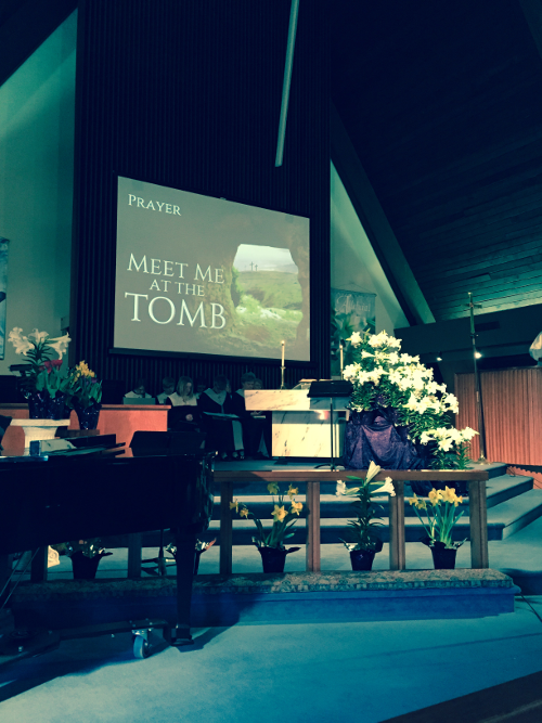
Figure 1. PowerPoint in church on Easter Sunday, 2015.
Seldom if ever has a commercial device exercised such dominance on the principal forms of public speech. For more than twenty-five years PowerPoint has shown up at lectures, events, talks, sermons, and briefings. What once were distinct occasions have now become formatted in the genre of the commercial demonstration. PowerPoint provides a common infrastructure, a template for the organization of speech, and for the logic of argumentation. As such, it shapes and produces the world. Nevertheless, the application has been almost entirely unremarked upon by critical scholars of media, technology, and the digital humanities. Why? Despite extraordinary claims about the total domination of algorithms, protocols, the digital, bits, and information, the material conditions of mundane software use go largely under-recognized as key sites for cultural work. Where, for example are the books about tax software, bug databases, or personal calendaring applications? Perhaps the omission is part of a larger failure to enact an everyday turn. Perhaps it is simply hard to see the forest for the trees.3
This essay critically contextualizes PowerPoint. We argue that many of the stylistic conventions associated with slideware have long been part of business communications. Personal computing, however, scaled up the production of presentations. Doing so linked knowledge work with personal expression. The result has been the rise of presentation culture. In an information society, nearly everyone presents. Analyzing presentation software makes visible the largely under-appreciated reliance on performative authority in knowledge production. By inadvertently privileging the relationships between personal computing and networked forms of sociality, cultural analysts have missed the ways personal computing transformed public culture, the ways software reconfigured the conditions of collective life. Engaging with such reconfigurations requires taking software and its extended materiality seriously. The essay concludes with a discussion of alternative presentation machineries. If we, as humanists, are to imagine futures with computational tools we will need to critically analyze and design forms of intellectual middleware that materialize relationships between methods of interpretation, data objects, and tools.4 We will need to ask questions like “How does PowerPoint think and how would we like presentation software to think?”
PowerPoint: Does it Suck or is it Evil?
PowerPoint, initially known as Presenter, was created by a Silicon Valley startup called Forethought Inc. Founded in 1983, the company focused on developing software that exploited the transition from character mapped to graphical interfaces. Eighteen months later, with no viable product, the founders initiated a ‘corporate restart.’ In 1987, under new leadership, Forethought shipped Presenter. The company sold its first 10,000 copies within a month. Microsoft then purchased the company for $14 million in cash making it the company’s largest acquisition at that time. By 1995 PowerPoint dominated market share and was more profitable than the software industry as an aggregated whole.5
Despite a range of competing software packages over the years – e.g. Pixie, Harvard Graphics, Cricket Presents, Keynote, and Prezi – PowerPoint has long been the dominant player and its interaction paradigm has remained effectively the same. Users build one slide at a time and control overall order and formatting via outline, slide sorter, and master slide views. The software presumes that presentations are constructed on personal computers with single-screens and local repositories. In 1992 transitions, animation, and programing capabilities were introduced but current users would probably feel quite comfortable with any earlier version of the tool.
PowerPoint’s constancy is curious in two respects. Digital media have radically scaled up in the past twenty-five years. In the 1980s when access to media was scarce it made sense to think of a document as comprising an entire presentation. Today repositories of hundreds of thousands of high-resolution images are common as are computing devices that support multiple screens. That presentations have remained unchanged in spite of transformations in media content and distribution is in and of itself rather striking. More striking is how dramatically public reception shifted given nothing really changed. For more than a decade PowerPoint was a darling of the software industry. Then in the 2000s, High-tech CEOs like IBM’s Lou Gerstner, Apple’s Steve Jobs, and Sun Microsystem’s Scott McNealy started blaming organizational inefficiency on the software and even banned its use. Director of Research Peter Norvig’s spoofed Gettysburg Address a la PowerPoint’s AutoContent Wizard, for example, became Internet famous.
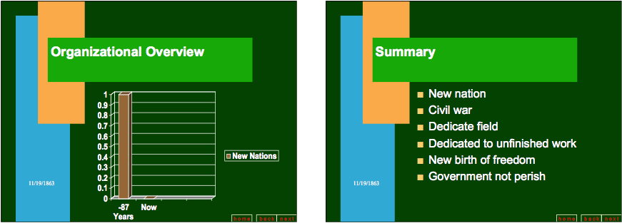
Figure 2. The Gettysburg Address as PowerPoint presentation.
Particularly striking were the critical voices emerging from the armed forces. Presentation technologies like overhead transparencies, whiteboards, wall charts, and photographic slides have long been part of military culture but PowerPoint, it seemed, ruined briefings. Military commanders sounded like critical cultural analysts as they warned the public about the dangers of decontextualized statements, the conferral of false authority on dubious knowledge, the risks of misrepresentation inherent in software visualizations. Officers reported devoting at least an hour per day to slide making and commanders worried as the program became “deeply embedded in a military culture that has come to rely on PowerPoint’s hierarchical ordering of a confused world.”6 Perhaps the concerns about “jazzy but often incoherent visuals” were displacements of deeper critiques of the Bush regime, a way of expressing a distaste for aesthetics in place of voicing fears that public life hinged on the illusion of perfect mastery despite chaos and uncertainty. In a widely circulated 2010 New York Times article General Stanley McChrystal explicitly linked strategic failures in Afghanistan to poor presentation visuals quipping, “When we understand that slide, we’ll have won the war.”7
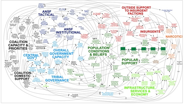
Figure 3. PowerPoint slide depicting United States military strategy in Afghanistan.
In a 2003 Slate article US Air Force historian Edward Mark voiced concerns that “almost all Air Force documents today, for example, are presented as PowerPoint briefings. They are almost never printed and rarely stored. When they are saved, they are often unaccompanied by any text. As a result…briefings are incomprehensible.”8 Commanders warned that distinctions between reporting, decision-making, and archiving were blurring.9 The decontextualization of military actions reduced war to “just a targeting exercise,” “creat[ing] the illusion of understanding and the illusion of control,” and keeping people from taking into account “political, economic, and ethnic forces.”10 Phrases like ‘death by PowerPoint’ and ‘hypnotizing chickens’ entered the vernacular, describing the numbing sensation accompanying slide briefings and the purposeful subjecting of crowds to presentations that lulled their critical faculties to sleep.11
No one gained as much mileage out of critiquing PowerPoint as Edward Tufte. The maven of lucid visualizations charged the program with destroying “the capacity for sustained, critical thought.”12 PowerPoint stacks information in time, forcing audiences to think sequentially rather than comparatively. Visual reading “works more effectively when relevant information is shown side by side. Often the more intense the detail, the greater the clarity and understanding.”13 PowerPoint prevents detailed comparisons between slides and makes it impossible to trace relationships between parts and wholes. When you consider the consequences of impaired analytical reasoning in mission critical situations the implications become troublingly apparent.
The centerpiece of Tufte’s self-published tract, The Cognitive Style of PowerPoint, is a close reading of NASA mission slides in which Tufte shows how PowerPoint’s graphic and discursive mechanisms obscured essential information that could have sounded the alarm about the possibility of an accident. When PowerPoint presentations crash shuttles (talk about the material force of interpretation!), boring audiences with “one damn slide after another” doesn’t just suck it’s evil.14 Ultimately, the Columbia Accident Investigation Board agreed:
It is easy to understand how a senior manager might read this PowerPoint slide and not realize that it addresses a life-threatening situation. At many points during its investigation, the Board was surprised to receive similar presentation slides from NASA officials in place of technical reports. The Board views the endemic use of PowerPoint briefing slides instead of technical papers as an illustration of the problematic methods of technical communication at NASA.15
In 2010 Tufte was appointed to President Obama’s Recovery Independent Advisory Panel to help the accountability board oversee a $787 billion economic stimulus program more effectively. At the same time, French journalist Franck Frommer published a book-length critique of PowerPoint arguing that PowerPoint is an apparatus for neoliberal managerial ideology. Frommer argued that although the software appears to support creativity, it works by limiting expression and neutralizing language. Frommer described PowerPoint as part of a model of society where “everyone had been forced, out of concern for efficiency (always!) and in conformity to the dominant mode of thinking, to abandon any capacity to reason, to discuss, and to criticize.”16
PowerPoint, however, is not without advocates. Talking Heads front man David Byrne, for example, is a true believer:
Although I began by making fun of the medium, I soon realized I could actually create things that were beautiful. … I could make works that were ‘about’ something, something beyond themselves, and that they could even have emotional resonance. What had I stumbled upon? Surely some techie or computer artist was already using this dumb program as an artistic medium. I couldn’t really have this territory all to myself — or could I?17

Figure 4. “Sea of Possibilities,” David Byrne.
After all, it is cheap, highly accessible, relatively straightforward and comes prepackaged on most Windows machines. It can be an extraordinary story-telling format. In 2005 trial lawyer (and part-time Baptist preacher) Mark Lanier was awarded a $253 million settlement against the pharmaceutical giant Merck in the first of several highly publicized trials surrounding the drug Vioxx (shown to cause heart attack and stroke). Lanier attributed his success to PowerPoint, “I no longer consider a speech a ‘speech.’ It is now a ‘presentation.’ Anyone who simply gives a speech, rather than a presentation, is driving a horse and buggy in the automobile age.”18
Lanier is not the only person to make his name aided by slideware. Legal scholar Lawrence Lessig is renown for his signature presentation style, a rhythmic progression of images paced at fifteen seconds apiece. In 2007, after a terminal diagnosis, Carnegie Mellon Computer Science professor Randy Pausch delivered The Last Lecture, a series of slides later repackaged as a best-selling book. Davis Guggenheim’s cinematic portrayal of former United States Vice President Al Gore presenting on climate change garnered two Academy Awards. Gore won the Nobel Prize. Whether formatted by Lessig or Takahashi method, whether delivered as PechaKucha or TED talk, presentations are emblematic of twenty-first century oral culture and its promises to reward specialists-turned-presenters with the Internet limelight of a worldwide stage.
The Materiality of PowerPoint: The Slide as Organizing Principle
When David Byrne or Lawrence Lessig push slideware beyond its defaults they highlight the specificities of the medium; artists make visible the limits and possibilities in material constraints. Close attention to PowerPoint’s materiality, however, reveals that it makes little difference if one treats the slide as blank canvas or rhythmic sequence. Either way, the tool uncompromisingly enforces the centrality of slides presented one-at-a-time. Large images can extend into the workspace but never onto an adjacent slide. Transitions such as wipes and dissolves operate across slides but they do not threaten the integrity of the slide as the basic narrative format.
Figure 5. Media cannot extend to adjacent slides.
In slide show mode, “No window borders, scroll bars, menu bars, etc. are shown, only each individual slide.”19 Eliminating the menu bar as proscenium breaks the windows interaction paradigm, leaving no trace of the multiplex desktop environment. The operating system recedes, the screen becomes the slide, and the audience looks at bullet points and images that have become architectural because they are conveyed at the scale of the space.
The only way to display multiple slides, and therefore to make visual arguments less dependent on sequence, is to project in production mode. Doing so, however, also reveals speaker notes, underlined misspellings, and the associated mess of backstage work. This rarely occurs. Even where existing functionalities make alternative narrative strategies possible, the strong distinctions between views intervenes. For example, the box-shaped selection tool that allows speakers to select a portion of the slide for public display is hidden from the audience. What could have been a zooming tool animating a procedure for relating parts to wholes is rendered as yet another cut to yet another slide. The audience misses the analytical move of animated magnification and the logic of an interaction technique. Imagine if presentation mode showed both the magnified selection and a thumbnail of the full slide in one corner. Moving the box would change the on-screen content while maintaining a sense of the overall slide design. But re-imagining the slide sorter or the presentation view would break the unity of the concept undergirding PowerPoint.
While bullets and chart junk receive the bulk of critical attention the conditioning imposed by the one slide, one screen paradigm unremarkably persists.
PowerPoint Precursors
That any application has been the subject of so much public discourse is striking but especially so given that its most defining features predate software entirely. Critics speak as though Microsoft invented bullet points but of course this isn’t true. Lists are as old as writing itself and spare language and info-graphics have long been part of corporate culture. Historian JoAnne Yates has traced the interest in managerial practices that used communications as means of coordination and control to the emergence of modern corporations in the latter half of the nineteenth century. Particularly in industries such as railroads, utilities, and manufacturing, which are characterized by high capital demands, geographic distribution, and functional diversity, formal internal business communications became a recognizable genre.20 Business reports were exercises in brevity. Traditional salutations fell away. Short rather than long lines predominated. Prose was de-prioritized. Conclusions were often presented first. This is the moment of the memo (as distinct from the business letter) and the executive summary report. Strict formatting rules about spacing, language, margins, and the placement of pins and clips turned reports into exercises in Taylorism, as though efficiency operated not only on bodies and machines but also at the scale of layout and text.
Alongside the push to rationalize communications came the use of graphics. Prior to the late nineteenth century graphs in the United States were mostly used for conveying statistical information like census figures. As multi-divisional corporations consolidated and standardized performance reports they adopted charts and graphs. Visual, numerical documents promised to speed information transmission while eliminating the biases and idiosyncrasies associated with writing style. Charts and graphs relied on the eye as an organ for rapidly detecting patterns, making comparisons, and detecting relationships between different data points. Targeted at busy executives, they appeared in reports, on wall charts, and lantern slides, as methods for coordinating strategic decision-making.
PowerPoint’s inheritance from the lineage of formal internal business communications is perhaps nowhere more evident than through the information practices at the DuPont Corporation. Yates traces the culture of gathering around graphics that took root in the twentieth century.21 Managers held shop conferences for superintendents from various factories and divisions. By debating the meaning of curves, slumps, and inconsistencies they adopted consistent practices through comparative work. In the years after World War I DuPont developed a system called the chart room that bound presentation to executive control. It was the heart of daily operations for DuPont executives. The chart room contained hundreds of large images suspended from the ceiling on movable metal frames that could be re-arranged via a system of tracks and switches adapted from equipment designed for moving bales of hay. The machinery facilitated comparison, discussion, and a concern with high-level strategy rather than operational detail. The chart room expressed and inculcated the ethos of systematic managerialism. It was a proprietary secret for more than three decades. Once revealed, it became a destination drawing tourists from around the world.
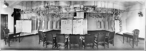
Figure 6. The Du Pont chart room.
By the second half of twentieth century business presentations were delivered by flip chart, whiteboard, overhead projector, and 35mm slide. Bullet points, lists, charts, graphs, text, images, and diagrams were all part of their style. Long before software companies made presentation programs the genre was relatively stable all over the world.
Presenter: Automating Corporate Presentations
In 1984 Robert Gaskins joined Forethought as part of their corporate restart. Gaskins hailed from the Palo Alto laboratory for Bell-Northern Research, the largest research and development operation in Canada. Prior to that he pursued an interdisciplinary Ph.D. in Computer Science, Linguistics, and English at University of California Berkeley. At the time Computer Science was still in the College of Letters and Science and Gaskins’ interests in natural languages, writing systems, and typesetting overlapped naturally with the technical field. Gaskins’ bio reads like that of a digital humanist.22 As chief programmer at the Berkeley Machine Translation Project he worked on Chinese-English translation techniques, typesetting Egyptian hieroglyphics, musical structures, and computer poetry. He co-authored (with Laura Gould) a Snobol4 textbook for humanists interested in text manipulation.23
Undergirding these sensibilities was a long personal history with presentations. Gaskins’ father was a prominent member of the National Audio-Visual Association and owned photographic equipment businesses. Gaskins recalls that “our most memorable family vacations were every few years when we went to visit the Eastman Kodak Co. in Rochester NY,” “it was the most established institution of my childhood.”24 At Bell-Northern Gaskins was steeped in a meeting culture reliant upon overhead transparencies and photographic slides. When Gaskins, Dennis Austin, and Tom Rudkin began producing the specifications for Presenter, they used Gaskins’ personal archive of presentations as a corpus for extracting the key features:
It wasn’t difficult to conclude that (1) a way of constructing “boxes and lines” diagrams with labels, plus (2) a way of constructing single-level and multi-level bulleted lists, and (3) a way of combining those freely below a title, together would make it easy to duplicate almost all the overheads in the corpus.25
Early pitches focused on convincing investors that presentations were already part of everyday life. Thus the business opportunity was in giving presenters direct control over content production. The average presenter made about a hundred slides per year (twelve monthly presentations of eight slides or four quarterly presentations of twenty-five slides) but rarely used a personal computer.26 International Data Corporation predicted that although in 1984 only 14 percent of computers were used for presentation graphics by 1989 52 percent of personal computers would be engaged in this form of work. Future Computing concurred.27 These industry analysts were predicting that a new horizontal category called ‘presentation software’ would emerge with the spread of graphical capabilities and they projected that this market would be larger than the market for spreadsheets.
Presentation capabilities were identified as major factors when considering computer purchases. This was software selling hardware, a killer app.
Presenter did indeed deliver a concrete reason to upgrade. It was a born-graphical application initially released as third-party software for Apple and one of the first really graphically demanding applications for Windows. It was among the first pieces of software to demonstrate full color use, to utilize the Apple Palette Manager, and to use shaded color backgrounds and context-sensitive color menus. Even the manuals and marketing materials were full color, an unheard of practice within the industry at that time. Moreover, PowerPoint development cycles were timed to release with new versions of operating systems. In 1990 PowerPoint 2.0 and Windows 3.0 shipped the same day. In 1992 PowerPoint 3.0, the first application designed exclusively for TrueType fonts, shipped within a month of Windows 3.1. PowerPoint then became a core component of Microsoft Office.
Presenter was designed to integrate into a range of computing environments. The software contained only the most rudimentary drawing and text tools. By relying instead on Apple’s clipboard functionality to import complex objects, images, and charts from other applications it allowed users to incorporate specialized sources of graphical and data elements within the same slide. Presenter supported a variety of output devices such as low-resolution printers, inkjet and laser printers and plotters. Subsequent versions allowed for modem delivery for the printing and preparation of 35mm slides, and later direct output to projectors and video displays. That said, the software was designed with the Apple LaserWriter in mind. The LaserWriter, introduced in 1985, was core to the rise of desktop publishing because it allowed users to print multiple fonts as well as arbitrary graphics at relatively high quality in either portrait or landscape orientation.
Initially, Presenter provided a desktop publishing process for creating overhead transparencies. Transparencies were clear, paper-sized films that could be placed on a lighted platform and projected onto the wall behind the speaker via a system of mirrors and lenses suspended from a raised arm. Overhead projectors were endemic to formal and informal settings for meetings, talks, and classes. Transparencies could be written on with special pens during a presentation or prepared in advance with handwritten content or typed text.
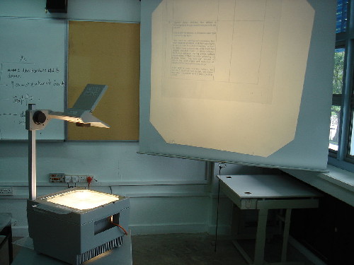
Figure 7. Overhead projector.
Making transparencies could be simple and straightforward or laborious and time-consuming. At Bell-Northern Gaskins became intimately acquainted with the complex possibilities of making presentation content for overheads. The process began with employees collaboratively sketching ideas on paper or whiteboard. These initial drafts were copied by assistants or secretaries, then revised, and then prepared as plain text in a Unix-based editor like Emacs running on a terminal connected to a PDP11/70. Separate formatting macros were written in TEX and images were drawn on a separate workstation via a locally written bitmap editor. Content, image, and formatting files were then uploaded for post-processing to a DEC-20 where each picture was parsed into character-sized files and treated as a pseudo-font that TEX would typeset to look like pictures. Once the program executed, the output was spooled to a Versatec plotter that printed onto a continuous roll of grainy thermal paper that was automatically sliced into letter-sized sheets. In case the cutter failed a pair of scissors was tied to the printer with a string. Any mistakes or revisions meant beginning again. Once output was approved it could then be transferred to overhead transparencies and its contrast enhanced through photocopying.28
Computer-aided typesetting enforced distinctions between content and formatting. Presenter, by contrast, allowed users to work with the finished product in real-time. Presentations consisted of a collection of slides that effectively operated as one-page documents with separate internal structures. Slides provided a 7.5” x 10” canvas in portrait or landscape orientation. Each slide was associated with approximately a page of notes. Presenter allowed users to view one slide at a time, or the entire presentation in thumbnails. The slide sorter view functioned as a virtual light table, allowing users to re-arrange slides through drag-and-drop interactions. A special master slide maintained structural similarity across slides and could be edited to generate presentation-wide changes in format. Slides copied from one presentation to another automatically reformatted to the parameters of their new environment. Slide show mode allowed the content producer to view their presentation in full-screen.29
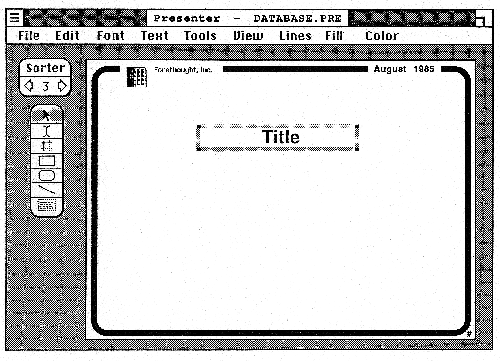 Figure 8. Original Presenter interaction flows.
Although initially designed for typesetting overhead transparencies, subsequent releases targeted the production of photographic slides. Slide presentations were far more difficult and expensive to prepare than overheads. They required professional photographers, graphic designers, and the services of corporate art departments or outside bureaus. Original artwork was photographed on 35mm film then placed in two inch-square mounts to fit Kodak Carousel projectors. Slide shows were generally in color. They rarely contained words but might feature soundtracks. Given costs of up to several hundred dollars per slide they were generally reserved for more formal occasions.
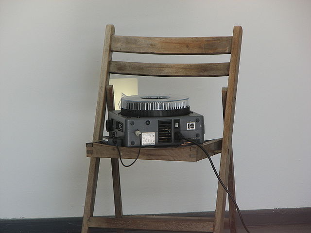
Figure 9. Kodak Carousel 35mm slide projector.
The dominant player in presentation slides was Genigraphics, a spin-off of General Electric that initially developed flight simulations technologies for NASA. In the 1970s the division repurposed their equipment to make slides for pitching their services to other government agencies and then went into the presentation-making business full-time. By 1986 Genigraphics was earning $75 million in revenue annually from their high-end hardware business and a custom service bureau franchise. Service bureaus were located in major United States cities and operated twenty-four hours a day 365 days per year. Nearly every Fortune 500 Company, most federal government agencies (including the military), large foundations, publishing houses, universities, and advertising agencies used Genigraphics. Some corporations had Genigraphics departments where in-house artists worked on Genigraphics machines.
Genigraphics slides were assembled through a mixture of photographic and computational processes. Highly skilled operators worked at custom consoles equipped with a full-color CRT monitor, solid-state raster display hardware, a keyboard, two joysticks, five rate knobs, pushbuttons, and switches. Operators entered graphics parameters, coordinates, and vector-based artwork while drawing the graphic by dropping the vertices on-screen into a pink wireframe. Fill colors and borders were then plotted and background colors gradated to produce a smooth effect. The graphics processor was a 16-bit minicomputer that could store programs or save artwork and send the images to a high-resolution recorder consisting of a 4000 line monochromatic CRT, a six-sector color wheel, a 35mm camera, and image control circuitry.30 It took about two minutes to render a 2000 line resolution slide.
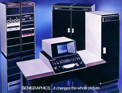
Figure 10. Genigraphics console.
By the late 1980s Genigraphics was interested in accepting business via personal computers. Forethought, now Microsoft’s Graphics Business Unit (GBU), was keen to learn from Genigraphics’ domain expertise. At MacWorld 1988 the companies announced their partnership. PowerPoint files could be transmitted directly to service bureaus and the companies would conduct joint sales calls on all corporate accounts.
It would be hard to overestimate Genigraphics’ influence on PowerPoint. PowerPoint 2.0 was designed for Genigraphics film recorders. It shipped with Genigraphics color palettes, schemes, and the distinctively Genigraphics color-gradient backgrounds. The application contained a ‘Send to Genigraphics’ menu item that wrote the presentation to floppy disk or transmitted the order directly via modem. Within three and a half months PowerPoint orders accounted for ten percent of revenue at Genigraphics service centers.
PowerPoint 3.0 was even more intimately dependent upon Genigraphics. The software incorporated a collection of clip art images and symbols that had been produced by hundreds of artists at dozens of service centers across tens of thousands of presentations. Genigraphics artists designed PowerPoint 3.0 colors, templates, and sample presentations. The software even used Genigraphics (rather than Excel) chart style. Bar charts were rendered two-dimensionally with apparent thickness added to make them seemingly recede from the axes. The technique made it easier for viewers to compare bar heights and estimate values from axis ticks and labels. Pie charts were handled analogously. Microsoft paid Genigraphics to produce more than 500 clip art drawings and symbols used in Microsoft programs.31 In 1989, after three years of flat revenue, Genigraphics sold its hardware business. By 1991 Genigraphics has created over 700,000 slides for more than 7000 customers. Genigraphics drivers continued shipping in PowerPoint boxes until 2003.
Once laptops with VGA connections became commercially viable, distinctions between productions streams for overheads, slides, and multimedia presentations effectively collapsed. Gone were the secretaries, artists, outside agencies and audio-visual providers once key to each of these processes. So too, presentation formats and styles gradually became less distinct.
Presentation Culture
The bulk of PowerPoint criticism has focused on the genre’s inadequacy as compared to essays, papers, and reports. Slide decks do, however, possess their own interesting properties as documents. Their modularity allows them to be generated as piles and then later assembled into a narrative order.
They can be single or multi-authored, can structure a range of outputs, and can be easily revised, re-shuffled, and re-used. Their virtues as a flexible authoring platform are well-suited to the demands of the modern corporation. Slide decks coordinate, collate, document, and report on the work of heterogeneous actors in different groups, across different sites, and at a range of organizational levels. They travel vertically and laterally, both inside and outside the firm. In many ways PowerPoint files exceed classification as documents to become what Yates and Orlikowski refer to as a “genre in use,” or structures that determine norms but do not wholly constrain social practices.32 They are platforms, repositories, and archives, serving to propose visions, structure agreements, and document work. Nevertheless, the software’s primary value comes less from distributed co-authoring than from an individual’s speech.
PowerPoint files can be read as documents but more often they are performed. Meetings are amongst the most time-consuming activities knowledge workers engage in and PowerPoint has done much to establish presentation as a dominant form of organizational work. PowerPoint may not have invented presentation styles but it certainly scaled up presentation culture. It would be hard to argue that the average presentation contains as much information as the average memo. Clearly slideware is about something else. Slides bind knowledge to performance rather than to representation. They are not designed to provide audiences with evidence that speaks for itself. Here, they diverge from the document as text.
The tight interdependencies of information, technology, and speech become most apparent in moments of breakdown and failure. Meetings without properly formatted slides cannot take place. Computer failures prevent speakers from talking about what they want to talk about. Students refuse to recognize the legitimacy of lecture content unaccompanied by slides. Even within functioning presentations, subtle cues signal that visuals and speech are bound into a common rhetorical object. Sociologist Hubert Knoblauch has focused on gestural coordinating of verbal content with on-screen images. Whether by hand, mouse, or pointer, the indexical move signifies that pictures do not stand alone.33 The speaker, decentered by the screen, enacts a “multimodal discourse” characterized by “two paradoxical patterns in discourse structure, a linear pattern in time, a sequential rhythm to discourse, and a non-linear pattern in space, a constellation of signs and symbols in three-dimensional space.”34 Multimodal discourse requires choreography, compositionality, ways of deciding how meaning ought to emerge from different channels, how they stand in relation, how audiences experience gestalt. There is a tremendous dependence upon not just knowledge production but also knowledge performance, or virtuosity.
Rich Gold, manager of the Research in Experimental Documents group at Xerox PARC and self-proclaimed PowerPoint maestro, characterized presentations as jazz. Slides are merely the starting point, the “bass rhythm, and chord changes over which the melody is improvised.”35 Presenters are expected to enact a special form of reading called ‘the gloss,’ a real-time explanation of the writing on the wall. Reading from notes or slides violates the expectation that a speaker can lay it down fresh every time, connecting with the group around a commonly held artifact. In great talks the visual and auditory channels seem to merge. Ideas and images lock together and meaning becomes thick and layered. The audience and speaker achieve collective effervescence through mutual flow, and listeners experience a sense of accelerated thinking as they improvise like the clarinet over sax, one octave up.36
For Gold, PowerPoint signaled an important transformation in organizational reading. Nineteenth century genres were falling by the wayside: “I don’t know if the novel is dead, but the memo certainly is. In its place rises the slide.”37 One can’t help but hear an uncanny echo and inversion of Victor Hugo’s claim that “the Printing Press will destroy the Church.” Gold, like every other medium theorist from Elizabeth Eisenstein and Walter Ong to Harold Innis and Marshall McLuhan, was arguing that a new mode of cultural expression (read: media) was transforming society and its institutional forms.38 Print may have materialized the Protestant Reformation but slideware brought bibliographic culture back to wall reading. Modern corporations, once comprised of document-reading individuals, now relied on co-located groups reading epigraphically. By turning distributed readerships into collective beholding, personal computing brought a theatrical quality to organizational life.
That slideware has been overlooked in software studies and by digital humanists reveals a general tendency to think through analytic frameworks derived from text. Digital formats have prompted conversations about the status of copyright, authorship, and the role of design and interactivity in the construction of meaning, but scholars continue to presume readerly modes of reception and use. By privileging cases of individuals networked via personal (private) devices, analysts treat software systems like reading publics. Even those who advocate taking social networking sites, wikis, blogs, virtual worlds, and databases seriously presume the distributed sociality characteristic of bibliographic culture. Presentation culture is a powerful reminder that before Gutenberg much reading was listening and that some of the most important contributions of computing have little to do with personal use. As Walter Ong points out, it can be exceedingly difficult for members of a literate society to think in terms of collective reading, “There is no collective noun or concept for readers corresponding to ‘audience.’ The collective ‘readership’ – this magazine has a readership of two million – is a far-gone abstraction. To think of readers as a united group, we have to fall back on calling them as an ‘audience’ as though they were in fact listeners.”39 Thinking about personal computing as wall reading means regarding digital media situationally and socially, as acquiring meaning through ritual and performative means. It means focusing on what knowledge does, who participates in its formation, and how it relies on social structures to achieve its effects.
In epigraphic culture slideware makes sense. Slides don’t perform to the standards of the essay or report because information transmission is not what is at stake. “In the sweaty hormone-steeped conference room, when all eyes are on the PowerPoint presenter with his or her slides dissolving from one to the next, the emphasis is on group, consensus, team, collaboration, compromise, unity.”40 It’s about “the war dance that inspires the fighting power of a tribe.”41 Question and answer sessions aren’t primarily about eliciting information. They are ritual means of determining whether or not the speaker is a member of the group (anyone who has endured an academic job talk knows this only too well). Presentations are a form of knowing highly dependent on the architectural conditions of reception, an implicit recognition that what we know, how we know it, and what we are willing to entertain depends on who we are with.
Sarah Kaplan, extending the work of Karen Knorr-Cetina, characterizes PowerPoint as the “epistemic machinery” for project-driven organizations.42 It provides an ideal apparatus for producing and legitimating strategic discourse. This specific form of knowledge work is particularly suited to contingent worlds of heterogeneous stakeholders where the survival of the firm is always apparently at stake. Progress is measured in the number of meetings attended, slides generated, and charts reviewed rather than in analytic quality. Experts are presentation adepts capable of setting agendas, structuring discussions, and demonstrating strategic ideas through the materiality of the slide. They are able to embody and perform constantly changing, distributed knowledge, to create a sense of order when none might be present, and to anchor discussions by narrating abstract images in view.43
Franck Frommer argues that PowerPoint is an ideological apparatus that has allowed decentralized organizations to discipline knowledge workers. As bureaucratic corporations gave way to liberated firms, project-oriented, entrepreneurial extroverts became the favored kind of employee. These individuals, marked by their ease in precarious conditions and networked worlds, imagine themselves as creative and free. For them, work is neither job nor calling, but rather a site for personal growth.44 Presentations, a form of work once reserved for the managerial few, became performance opportunities for the many, moments of personal expression where individuals could gain attention and approbation by demonstrating the capacity to communicate, adapt, and shine.
These seemingly voluntary forms of expression provide employees with countless opportunities to subject themselves to the judgments of others. Presentations are a mode of address that doubles as an auditing method. The characteristically neutral language of presentations can make one feel implacable, unassailable, like wearing a suit. Ironically, these opportunities for personal expression rely on atomized collections of disconnected phrases lacking logical transitions or definite meaning. It is here that the interpellation of the new worker occurs. Presentations generate unification between speaker and organization precisely because the format relies on the orator’s talent for bringing forward key concepts in spectacular terms to create a sense that everything connects. They are a medium for channeling charisma through institutional means. PowerPoint style arms the speaker with pre-scripted forms of authoritative speech – nominalizations, indefinite articles, infinitives, elisions – and martial references – tactics, strategies, roadmaps – to generate agreement with strategic discourse.45 It is no coincidence that PowerPoint’s sample presentation included in the very first version in 1987 was of Christopher Columbus convincing the Spanish monarchs to fund his venture to the new world.46
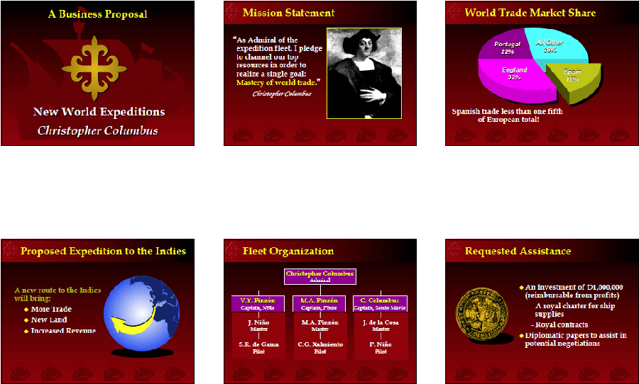
Figure 11. Christopher Columbus PowerPoint presentation.
There is perhaps no more tragic case of interpellation than Colin Powell’s 2003 United Nations presentation on weapons of mass destruction in Iraq. The only member of the cabinet that seemed capable of doubting the logics of the Bush regime became the front man charged with convincing an international public to go to war. Powell’s performance echoed Adlai Stevenson’s 1962 flip-chart presentation delivered in same room during the Cuban Missile Crisis. Stevenson showed a series of aerial photographs and maps that he interpreted as undeniable proof of Soviet missiles in Cuban territory.47 Powell exploited PowerPoint’s ability to weave text, audio recordings, images, and videos into “an accumulation of facts” that demonstrated his government’s powers of surveillance.48
Figure 12. Colin Powell’s PowerPoint presentation to the United Nations Security Council.
David Stark and Verena Paravel have used the Powell case to argue that PowerPoint’s capacity to re-present materials gathered and produced elsewhere in front of eye-witnesses signals a dramatic transformation in the “geography of persuasion.”49 As presentations become privileged forms of speech politics becomes entangled with the affordances of a software package. The consequences of achieving authority through an “accumulation of facts” are being increasingly felt in a range of institutional contexts. By 2015, for example, eleven criminal convictions had been overturned in United States appellate courts based on prosecutors’ egregious misuses of PowerPoint.50 Where Stark and Paravel preserve a note of optimism by hoping that digital technologies will allow counter-demonstrations to emerge online we are more cautious. The very materiality of slideware guarantees that even oppositional decks are comprised of just one damn slide after another.
Slide-by-Slide: Art History and Double Slide Projection
Things could be otherwise. In fact, they have been. Consider art history, a discipline uniquely forged through a fusion of projection technologies with speech. Prior to the late nineteenth century adoption of photographic slides art lecturers relied on the audiences’ familiarity with works, perhaps from a Grand Tour, or they employed props like drawings, woodcuts, casts, or models. Speech was characterized by rhetorical techniques such as ekphrasis that rendered artwork present through verbal transmissions and personal response. With the widespread availability of photographic slides, art history transformed. Lecturers were not only able to reach larger audiences and broader publics they also began claiming a new status as scientific authorities. Photographs provided visual evidence, a form of data for the discipline. Magic lanterns transformed lecture halls and classrooms into privileged sites for observation and analysis. As instruments for public viewing, projection technologies allowed art historians to claim what Lorraine Daston and Peter Galison have called “the epistemic virtue” of objectivity.51
Art historians grounded technological expertise in image-dependent orality. They adopted rhetorical strategies for stressing the common space-time of speaker, audience, and artwork. Slides were treated as art objects themselves rather than photographs of art objects. Lecturers moved back and forth between direct observations, critical analysis, and historical detail, pulling the audience along as collective witnesses of demonstrable facts. The lit images in darkened rooms helped coordinate the audiences’ vision, facilitating a sense of intimacy, as lecturers braided arguments and collective beholding into a common performative frame. In the process, audience members became modern spectators trained to confirm art historical interpretations of the meanings of slides.
Mature art historians are distinguished by their comfort with slides. They are masters of exposition as beholding. Multiple art historians have written about Heinrich Wölfflin as exemplary and influential within the tradition of the lecture. They say he began by considering images in silence, fixing his gaze upon them as though seeing them for the first time. His silence generated an atmosphere of reverence, a sense of expectation, a feeling that the artwork was coming into presence within the scene. Wölfflin began slowly with what Robert Nelson describes as “hesitancy that seems more appropriate for a séance than a classroom.”52 Wölfflin’s identification with the image became so complete that eventually any deictics fell away “making it seem as if ancient statues, whether male or female, possessed deep, rich, German-accented voices.”53 Together, his voice, gaze, and presentation technology confirmed the status of the artwork. A generation of students absorbed his mannerisms, imitating his pauses in speech and his solemn affect.
Wölfflin invented dual-slide projection. He considered juxtaposition the fundamental analytic technique of the art historian. Displaying two separate images at a time allowed the lecturer to contextualize, compare, and explore variations. It allowed the art historian to produce objective readings by hypothesizing, observing relationships between parts and wholes, producing taxonomic classifications, and by verifying visual arguments in public settings. By using a ‘Grundakkord’ or anchor slide returned to over and again he could digress and maintain a central narrative. Of course the technical-analytic assemblage of the art history lecture is not without its problematic politics. The very emphasis on systematic comparisons that are mediated (unacknowledged) through the materiality of the photographic slide legitimates a form of visuality in which objects from very different cultural and historical conditions can be positioned side by side for the purposes of expert comparison.
Beyond PowerPoint
Double slide projection is just one example of how conceptual grounding manifests through infrastructure. If a conceptual foundation changes, the infrastructure may not necessarily be adequate, and if the infrastructure changes, the concept may shift as well. Slideware works because a concept and infrastructure have stabilized around a concern with single screens and serial arguments. Of course PowerPoint can show two images at once (albeit at reduced size) but duality on a single screen is not the same as two separate screens. The difference is in more than just the framing. Single centralized displays shape reception differently than distributed multi-display environments.54 As multi-screen environments and large online repositories proliferate and as critical scholars take up digital platforms, the limits of slideware should become increasingly apparent. PowerPoint will not be replaced, but its ubiquity may be challenged in the long-term. Moving beyond PowerPoint requires thinking about both the concepts and infrastructures undergirding occasions for speech.
For more than a decade the Umeå University HUMlab has been re-imagining infrastructures for critical humanistic inquiry and digital scholarship. In 2015 the lab added a display studio explicitly designed to challenge the default architecture of presentation. Rather than including a single, central, state-of-the-art, high-resolution screen, researchers implemented a non-symmetric, two-screen arrangement for stereo projection. The angled setup is central. The right hand-screen is vertically oriented, requiring two projectors tilted sideways. Differently shaped screens allow presenters to provide different vantages on the same information, with attention to the disjunctures between these visions. Imagine, for example, a three-dimensional model of the Colosseum on the left hand screen and a portal to the data underlying the rendering on the right.
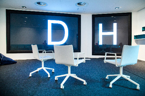
Figure 13. HUMlab display studio.
PowerPoint does not work in the display studio. For that matter, neither does Keynote, Google Slides, or Prezi. The two-screen architecture prevents it. Using the space requires stepping out of default modes of presentation to consider alternative strategies for multimodal discourse. Although the display studio as epistemic machinery will likely prove better for certain forms of research over others, the sheer deviation from the dominant paradigm constitutes a critical resource. When architecture becomes designed around a single presentation format there are no alternatives in software. Asking for other architectures, however, opens anew the conceptual-material possibilities for knowledge production. PowerPoint enacted only one such possibility but many others are waiting to be imagined and designed. HUMlab researchers have recently begun developing presentation authoring software for multi-screen ecologies.
Conclusion
PowerPoint is not a slide projector without a slide tray. It is not a neutral automation of existing processes. It is a part of visual culture, an increasingly everyday experience at every kind of occasion for speech. In 1991 the Graphics Business Unit of Microsoft (formerly Forethought Inc.) built their conference room with rear projection, a custom podium, concealed power supplies, and networking and teleconferencing connections. They were prototyping the future, imagining a world of U-shaped rather than oval conference tables, where slideware rather than documents predominated. Today it would be unusual to find a meeting room that doesn’t presume slideware. PowerPoint colonized wall reading and it changed the very walls. We have yet to document the histories and effects of this transformation.
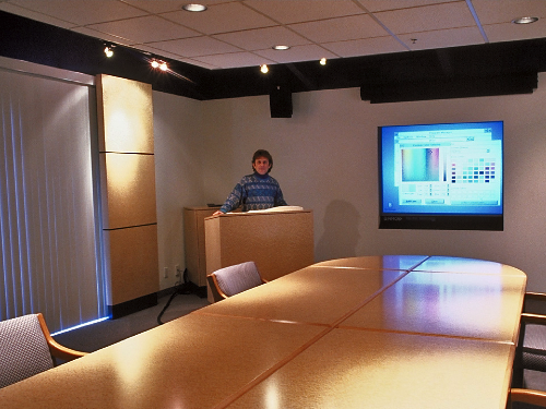
Figure 14. The Graphics Business Unit conference room.
PowerPoint is just one example of the oft-overlooked conditioning of knowledge production. The software profoundly shaped basic social expectations, technical conditions, and architectural pre-requisites for speech yet it was uncritically absorbed in nearly every quarter. PowerPoint does not zoom. It does not allow spontaneous comparisons. It does not accommodate several screens, multiple threads, or distributed live collaborations. It makes the analytic move of systematic comparison, so prevalent in late nineteenth and early twentieth century information presentations, extremely difficult to make. Moreover, its expansion has meant that once distinct situations have become more alike. Meetings, sermons, lectures, and talks increasingly employ the technics of commercial demonstration. Twenty-first century occasions for speech are structured by a platform that enforces the paradigm of one-slide-at-a-time.
Knowledge infrastructures were not always already present in some precise configuration. They are cultural works, constantly constructed, reified, and transformed. Thus, knowledge work contains expressive possibilities, means of conveying the sensations of new logics as they emerge. Admittedly PowerPoint possesses the virtue of ubiquity. Nevertheless, critical scholars might do well to imagine new compositions formats. Doing so will inevitably complicate the media ecology but it will also force us to decide which modes of speech disciplines want. Perhaps knowledge need not be copied, templated, or distributed in a common form. Perhaps idiosyncrasy and specificity are resources as well. Triptychs, expanded cinema, and installations may not easily port to the web but like playing a violin at Carnegie Hall or in a Gothic cathedral or a subway tunnel, they may serve as demonstrations that engaging with the specificities of local infrastructures is a difference that makes a difference. There are performative dimensions to knowledge transmission and material specificities in the relationships between form and content.
In an essay on the seeming inevitability of Moore’s Law, computer historian Paul Ceruzzi closes with a trenchant reminder that “we pass critical and moral judgment on Harry Truman for his decision to use atomic bombs against Japan, we criticize a museum for showing, out of context, the aircraft that carried the first bomb, yet we ignore our ability to exert more than a smidgen of control over technologies that affect – determine – our daily lives.”55 Scholars argue against technological determinism while ceding daily interactions to the push of engineering. By critiquing, contextualizing, and defining everyday processes of production we might recognize tools as concepts that foreground analytics. We might design to support dialogue, deliberation, and multiple points of view. Doing so might mean we have more and different things to say at every occasion for speech.
Acknowledgments
The authors would like to thank Johanna Drucker, Robert Gaskins, Lisa Gitelman, and Carlin Wing, all generous readers of early drafts.
Bibliography
Armstrong, Ken. “Next Slide Please: Another Conviction is Thrown Out After Prosecutors Misuse PowerPoint,” The Marshall Project, January 22, 2015 https://www.themarshallproject.org/2015/01/22/next-slide-please.
Austin, Dennis, Tom Rudkin, and Robert Gaskins. “Presenter Specification: May 22, 1986,” Forethought Inc. http://www.robertgaskins.com/powerpoint-history/documents/.
Boettinger, Henry M. Moving Mountains: The Art of Letting Others See Things Your Way. New York and London: Macmillan, 1969.
Bucher, Hans-Juergen, and Philipp Niemann. “Visualizing Science: The Reception of PowerPoint
Presentations,” Visual Communication 11 (2012): 283-306.
Bumiller, Elisabeth. “We Have Met the Enemy and He Is PowerPoint.” New York Times, April 27, 2010.
Byrne, David. “Learning to Love PowerPoint,” Wired 11.09, September 2003.
http://archive.wired.com/wired/archive/11.09/ppt1.html.
Ceruzzi, Paul. “Moore’s Law and Technological Determinism: Reflections on the History of Technology.” Technology and Culture 46, no. 3 (2005): 584-593.
Columbia Accident Investigation Board Report. Washington D.C.: National Aeronautics and Space
Administration and the Government Printing Office, 2003.
Crean, Melanie . “Hypnotizing Chickens.” Women’s Studies Quarterly 40, no. 1-2 (2012): 331-339.
Daston, Lorraine, and Peter Galison. Objectivity. New York: Zone, 2010.
Davison, Patrick. ”Because of the Pixels: On the History, Form, and Influence of MS Paint.” Journal of Visual Culture 13, no. 3 (2014): 275-297.
Drucker, Johanna, and Patrik Svensson. “The Why and How of Middleware.” (working paper, Department of Information Studies, University of California Los Angeles, and Umeå University).
Eisenstein, Elizabeth. The Printing Press as an Agent of Change: Communications and Cultural Transformations in Early-Modern Europe (Volumes 1 & 2). Cambridge: Cambridge University Press, 1979.
Frommer, Franck. How PowerPoint Makes You Stupid: The Faulty Causality, Sloppy Logic, Decontextualized Data,
and Seductive Showmanship that have Taken over Our Thinking, translated by George Holoch. New York: The New Press, 2012.
Gaskins, Robert. “Presenter: Product Marketing Analysis June 27, 1986,” Forethought Inc.
http://www.robertgaskins.com/powerpoint-history/documents/.
Gaskins, Robert. Sweating Bullets: Notes About Inventing PowerPoint. San Francisco: Vinland Books, 2012.
Gold, Rich. “Reading PowerPoint,” in Working with Words and Images: New Steps in an Old Dance, edited by
Nancy Allen, 256-270. Stamford, CT: Ablex, 2002.
Innis, Harold. Empire and Communications. Toronto: Dundurn Press Limited, 2007.
Jaffe, Greg. “What’s Your Point, Lieutenant? Please, Just Cut to the Pie Charts.” The Wall Street Journal,
April 26, 2000. http://www.wsj.com/articles/SB956703757412556977.
Kaplan, Fred. “The End of History: How E-Mail is Wrecking our National Archive.” Slate June 4, 2003.
http://www.slate.com/articles/news_and_politics/war_stories/2003/06/the_end_of_history.html.
Kaplan, Sarah. “Strategy and PowerPoint: An Inquiry into the Epistemic Culture and Machinery of Strategy Making.” Organization Science 22, no. 2 (2011): 320-346.
Knoblauch, Hubert. “The Performance of Knowledge: Pointing and Knowledge in Presentations.” Cultural Sociology 2, no. 1 (2008): 75-97.
Lanier, W. Mark. “Constructing the Ultimate PowerPoint.” American Bar Association Section of Litigation Annual Conference, April 24-26, 2013.
McLuhan, Marshall. Understanding Media: The Extensions of Man. London: Routledge and Kegan Paul Limited, 1964.
Moreland, D. Verne. “Computer-Generated Stereograms: A New Dimension for the Graphic Arts.”
Proceedings of the 3rd Annual Conference on Computer Graphics and Interactive Techniques (SIGGRAPH ’76) (1976): 19-24.
Moretti, Franco, and Dominique Pestre, “Bankspeak: The Language of World Bank Reports 1946-2012” Stanford Literary Lab Pamphlet 9 (2015).
Nelson, Robert. “The Slide Lecture, or the Work of Art ‘History’ in the Age of Mechanical Reproduction.” Critical Inquiry 26, no. 3 (2000): 414-434.
Norvig, Peter. “The Gettysburg PowerPoint Presentation.” http://www.norvig.com/Gettysburg/index.htm.
Ong, Walter. Orality and Literacy: The Technologizing of the Word. London: Routledge,1982.
Parker, Ian. “Absolute PowerPoint: Can a Software Package Edit Our Thoughts?,” New Yorker, May 28, 2001, 76-87.
Powell, Colin. Iraq: Failing to Disarm, Address to the United Nations Security Council, February 5, 2003.
Robles, Erica, Cliff Nass, and Adam Kahn. “The Social Life of Information Displays: How Screens Shape Psychological Responses in Social Contexts.” Human-Computer Interaction 24, no. 1-2 (2009): 48-78.
Stark, David, and Verena Paravel. “PowerPoint in Public: Technologies and the New Morphology of Demonstration.” Theory, Culture, and Society 25, no. 5 (2008): 30-55.
Tufte, Edward. “PowerPoint is Evil,” Wired 11.09 (2003).
http://archive.wired.com/wired/archive/11.09/ppt2.html
– – – . The Cognitive Style of PowerPoint. Cheshire, CN: Graphics Press LLC, 2003.
Turner, Fred. “Burning Man at Google: A Cultural Infrastructure for New Media Production.” New Media &
Society 11 (2009): 73-94.
Yakura, Elaine. “Visualizing an Information Technology Project: The Role of PowerPoint Presentations over Time.” Information and Organization 23 (2013): 258-276.
Yates, JoAnne. Control Through Communication: The Rise of System in American Management. Baltimore, MD: Johns Hopkins, 1989.
– – – . “Graphs as a Managerial Tool: A Case Study of Du Pont’s Use of Graphs in the Early
Twentieth Century.” Journal of Business Communication 22, no. 1 (1985): 5-33.
Yates, JoAnne, and Wanda Orlikowski. “The PowerPoint Presentation and Its Corollaries: How Genres Shape Communicative Action in Organizations,” in Communicative Practices in Workplaces and Professions: Cultural Perspectives on the Regulation of Discourse and Organizations, edited by Mark Zachry and Charlotte Thralls. Amityville, NY: Baywood, 2007.
Notes
- http://news.microsoft.com/2012/07/19/microsoft-reports-record-fourth-quarter-and-full-year-revenue/. ↩
- Gaskins, Sweating Bullets, 426-427. ↩
- There are notable efforts underway to bring about an ‘everyday turn’ in software studies, see Matthew Kirschenbaum’s project on Word Processing, or Davison, “Because of the Pixels.” ↩
- Drucker and Svensson, “The Why and How of Middleware.” ↩
- Gaskins, ibid., 405. ↩
- Bumiller, “We Have Met the Enemy.” ↩
- Ibid. ↩
- Kaplan, “The End of History.” ↩
- Jaffe, “What’s Your Point, Lieutenant?” ↩
- Bumiller, ibid. ↩
- Crean, “Hypnotizing Chickens.” ↩
- Tufte,”PowerPoint is Evil.” ↩
- Ibid. ↩
- Ibid. ↩
- Columbia Accident Investigation Board Report, 191. ↩
- Frommer, How PowerPoint Makes You Stupid, 228. ↩
- Byrne, “Learning to Love PowerPoint.” ↩
- Lanier, Constructing the Ultimate PowerPoint, 4. ↩
- Austin, Rudkin, and Gaskins. Presenter Specification, 24. ↩
- Yates, Control through Communication. ↩
- See ibid., and Yates, “Graphs as a Managerial Tool.” ↩
- Gaskins’ consistently literary bent contributes to this impression. PowerPoint was the first software application to ship with a hardbound book as its manual. His 500+ page self-published reflection on presentation software is replete with literary allusions to figures like Samuel Johnson. ↩
- Snobol was authored by Paul McJones and Charles Simonyi. Simonyi later co-invented Bravo, the first word processing software, at Xerox PARC and then Word at Microsoft. ↩
- Gaskins, ibid., 23. ↩
- Ibid., 89. ↩
- Ibid., 77. ↩
- Gaskins, Product Marketing Analysis, 11. ↩
- Gaskins, Sweating Bullets, 31. ↩
- Presenter obscured the Apple menu bar when in full-screen mode, thus violating the interface rules and breaking out of the windowing environment. ↩
- Moreland, “Computer-generated Stereograms.” ↩
- Gaskins, ibid., 351. ↩
- Yates and Orlikowski. “The PowerPoint Presentation and Its Corollaries.” ↩
- Knoblauch, “The Performance of Knowledge.” ↩
- Bucher and Niemann, “Visualizing Science”, 283. ↩
- Gold, “Reading PowerPoint”, 264. ↩
- Ibid., 265. ↩
- Ibid., 258. ↩
- See for example Eisenstein, The Printing Press as an Agent of Change, Ong, Orality and Literacy, Innis, Empire and Communications, McLuhan, Understanding Media. ↩
- Ong, ibid, 74. ↩
- Gold, ibid., 260. ↩
- Gold, ibid., 261-262. ↩
- Kaplan, “Strategy and PowerPoint.” ↩
- Yakura, “Visualizing an Information Technology Project.” ↩
- On the suturing on bohemian styles with knowledge work, see Turner, “Burning Man at Google.” ↩
- Similar syntactical tendencies are documented in Moretti and Pestre, “Bankspeak.” ↩
- Gaskins credits the idea of the Christopher Columbus presentation to Henry Boettinger’s 1969 book on presentations, Moving Mountains. ↩
- Stark and Paravel, “PowerPoint in Public.” ↩
- Powell, Iraq: Failing to Disarm. ↩
- Stark and Paravel, ibid., 34. ↩
- Armstrong, “Next Slide Please.” ↩
- Daston and Galison, Objectivity. ↩
- Nelson, “The Slide Lecture.” ↩
- Ibid., 419. ↩
- Robles, Nass, and Kahn, “The Social Life of Information Displays.” ↩
- Ceruzzi, “Moore’s Law and Technological Determinism”, 587-588. ↩